
Painting as the "Alphabet of the Spirit"
This site is community-supported. We may earn a commission (at no extra cost) when you buy through our links.

The Exploratory Open Palette of Seth Tummins
His Vasari Set is Just the Beginning
Featured Paints
Explorations on the Horizon of Color
Discovering Seth Tummins' work was like walking into a subtly different dimension. Maybe it is his posts that read like poetry, maybe it's lines that read like the introduction to a documentary. Before a person even knows the location of one of the landscapes, in the orchid purples and the salmon-orange sky, a person can feel something of their stillness and their mystery.
Tummins has his own Vasari set, and we were eager to hear how he navigates his palette to create careful glissandos of muted tones, alongside chromatic moments.
The way Tummins writes is as poignant as his paintings. Imagine this line being read aloud as the camera pans across the landscape. "I am from Middle Tennessee, a particular part of that region that has always been on the fringes of history and never in its center." From No More Forever.
Tummins introduces his work on his site with what he calls a premise. "The premise of this work is to serve as an introduction to one another, to our lands, and to our special existence. It is also intended to foster the collecting of imagery as pieces of heritage worthy of passing on to posterity. Homes will change, fields will change, towns will change, and these facts give cause to pass on something tangible so that others, future families and various interested parties, may know more fully that we lived and thought of them enough to leave something of worth. May you find that what unfolds is more than a record, though it is at least that. May you find that it is, in fact, the expression of a deeply resonating chord that wishes for others to awaken to its resonance and join in the kind of life that can only grow from gratitude." - Seth Tummins
Tummins is an artist based in Middle Tennessee, however he also has series of paintings of the West from travels through Wyoming, Montana, Colorado, and New Mexico. An early foray into painting in college was initially tabled, and in adulthood Tummins began to create the unique landscapes he is known for today. Largely self-taught, Tummins is an inspiration to aspiring painters. Vasari offers a special Seth Tummins set, and most of Tummins' palette is comprised of Vasari paints.

Seth Tummins, Do Not Go Gentle, 18 x 36 in., oil on linen. Photo courtesy of the artist.
Seth Tummins Vasari Palette
Not many artists have the claim to fame of having their own Vasari palette, and Tummins' is arguably one of the first we'd gravitate towards as it's a visually refreshing and unique collection of colors. The Colors for an Open Palette is not as much of a beginner palette (similarly neither does it seem like a core palette), but it is an enthralling palette supplement. However, one of the true star colors of the palette, Ultramarine Violet, is given its own discussion later in the article.
Colors in Seth Tummins' Vasari Palette Colors for an Open Palette Paints chosen by Seth Tummins
We were interested in this set on a granular level (pigment-by-pigment) as part of how Tummins weaves togethers his color harmonies, which alternate between muted tones and high chroma notes.
Lily Rose-(Pigments unknown). Tummins mentioned that color became a bit more important than some of the technical details, though those are interesting. In terms of color it is a lovely one, though we wish Vasari convenience blends would list their pigments. Vasari describes this color as a, "Richly pigmented tint of premium Quinacridone," described as cool and opaque. One wonders if it might be one of several quinacridone rose colors (PV19 rose shade, or another quinacridone pigment) tinted with white.
Ruby Violet Light- (Pigments Unknown). "An opaque reddish version of our Quinacridone Ruby Violet" Once again, since Vasari does not list their pigments on blends, it's difficult to say which exact quinacridone pigment is used here, however it may be a Quinacridone Violet (PV19 comes in several shades).
Indigo Blue- (PB27 and PBk11). A blend of Prussian Blue and Mars Black. It is interesting to see a blue-black blend in a palette. However, Ultramarine Violet is actually the color Tummins recommends most (more below) and would be the most preferred note here. However, there has been a bit of uncertainty in the broader pigment world as to whether specific varieties of Ultramarine Violet will be available in the future. Ultramarine Violet is a good color to pick up in addition to this set.
Alpine Green Extra Pale - (PG7 and PW6). Made of Phthalo Green PG7, and Titanium White PW6. Vasari calls Alpine Green Extra Pale an, "...Icy light blue green tint of Phthalo Green and White. More blue than green."
Video Blue Extra Pale- (Pigments Unknown). This very light blue is described by Vasari as, "Delicate sky blue, cool, and far lighter in value than the Video Blue."
Ship Rock- (Pigments Unknown). Ship Rock is a very warm almost khahi color- called a gray but more of a variety of beige. This color is part of another set, one of the Scott Christensen Grays, which is very useful for landscape.
Silverpoint- (Pigments Unknown). Silverpoint is another Scott Christensen Gray. This is a "medium value neutral gray" but we've noticed it's rather bluish. Also a very nice muted blue for landscape.
Cadmium Yellow Orange- (PO20). This is one of several cadmium orange colors by Vasari and is described as the less less-red version.
Tummins writes more about his palette below. This set can also be found on Vasari's site.

Seth Tummins Colors for an Open Palette by Vasari. Indigo, Lily Rose, Ruby Violet Light, Alpine Green Extra Pale, Video Blue Extra Pale, Ship Rock, Silverpoint, Cadmium Yellow Orange.
Seth Tummins Vasari Set
Colors for an Open Palette
Using Pink to Say 'Distance' Instead of Blue
"...an introduction to one another, to our lands, and to our special existence"
A Palette for Perception Beyond Theory
This was one of the tasteful notes I picked up on in Tummins' paintings of the West-- something in the menagerie of well-ordered brush strokes creates the feeling of what one sees in those actual landscapes, something that defies and re-writes the laws of painting books, whose insights were written for other places. Tummins is a master of subtlety and here has has nailed the low-chroma tones that make the subtle rainbow of sunset which is sometimes seen there.
What if I said distant with pink instead of blue?
One of the clues may be found in the way he wrote about his palette, "We all have a standard palette of colors we use. I normally use just a few colors. But how do I get new questions? How do I avoid making the same arrangements, mixing the same colors, solving problems in the same way? I ask myself questions. 'Why am I using this all the time? What would happen if I said ‘distant’ with pink instead of blue? In what ways can I say ‘hushed’ without being too sweet? Can I look at nature as the starting point and not the goal? What if I said ‘sunlight’ with a cool tone instead of a warm tone?'”
In regard to the Vasari palette supplement he speaks of, "Using pink to modify green, seeing ruby violet light at dusk, softening with Ship Rock, " and notes, "There are so many options here."

Seth Tummins, Good Medicine, 16.25 x 22.25 in., oil on linen. Photo courtesy of the artist.
Colors for an Open Palette
Options for discovery chosen by Seth Tummins
Exploring a Core Palette
"...Facts give cause to pass on something tangible..."
"A split primary palette or less is normal for me. Until it isn’t."
Tummins' core palette tends to be triadic with important caveats for experimentation. While we were mesmerized by the mint greens in realistic landscape, as well as the candy pinks and rich indigos, we wondered about the core palette that underlies his work.
With a flexibility for the subject matter, he replied, "Some sort of yellow, red, and blue," which varies depending on what Tummins is painting. Though, we all know the choices for yellow, red, and blue are myriad. If you want to really dig in to what he uses, Tummins says the Vasari Elemental Set is a great place to start.
In regard to the specific colors he likes, he added, "Usually, Brilliant Lemon, many times an Ochre," while noting that Vasari offers several with different characteristics, and to that he adds, "Permanent Red, and Ultramarine."
While RGB triads are well-loved in historical painting traditions, the precise choices do matter. Tummins elaborated, "However, it is also common for me to use two of each “primary” - Permanent Red and Ruby Red (used to be Ruby Violet), Brilliant Lemon and an Ochre, Ultramarine and Cobalt."
In short, he recommended the Vasari Elemental Set as a good starting place. But there's more.

Seth Tummins, Thermopolis, 6 x 10 in., oil on linen. Maxwell Alexander Gallery Small Works Show. Photo courtesy of the artist.
Vasari Elemental Set
Seth Tummins' recommendation as a starting point for a core palette
A Recent Palette
Brilliant Lemon is made of an unusual pigment in oils, PY168, Quinophthalone Yellow, with a lightfastness rating of II (very good, though some may list it as excellent depending on the supplier). Vasari describes it as an opaque cool yellow.
Yellow Ochre Vasari calls this, "Authentic natural ochre, golden, translucent, and warm. "
French Raw Sienna Light Genuine Tummins particularly noted this Raw Sienna among the useful ochres. Vasari describes it as a deepened ochre with an "earthy green gold."
Permanent Bright Red Vasari's Permanent Bright Red is a slightly oranger PR254 than most versions of Pyrrole Red.
Ruby Red A red version of PV19 (a quinacridone pigment that comes in three color notes- this is the red one).
French Ochre Red Genuine An earthtone red, described as having a delicate mixing strength.
Ultramarine Violet Vasari describes this color as a, "Dark, but transparent, bluish violet that mixes best with cool primaries, this subtle variation of Ultramarine Blue also quiets color and intensity in a mixture and produces delicate lavender tints with white." This is a color that Tummins wished to include in the Colors for the Open Palette, however its future is a little uncertain due to shakeups within the wider pigment industry. Ultramarine Violet, PV15 is a very useful artists color.
Rome Black a rare color in oils. It is difficult to find the pigment NBr8 in oils. Vasari makes their Rome Black out of "...Ground Lignite, a soft brown coal, sourced from Verona, Italy." It is a, "Transparent historic brown-black, in use since the 15th century," and they add, that " Rome Black is warm and fairly nuanced in mixing."
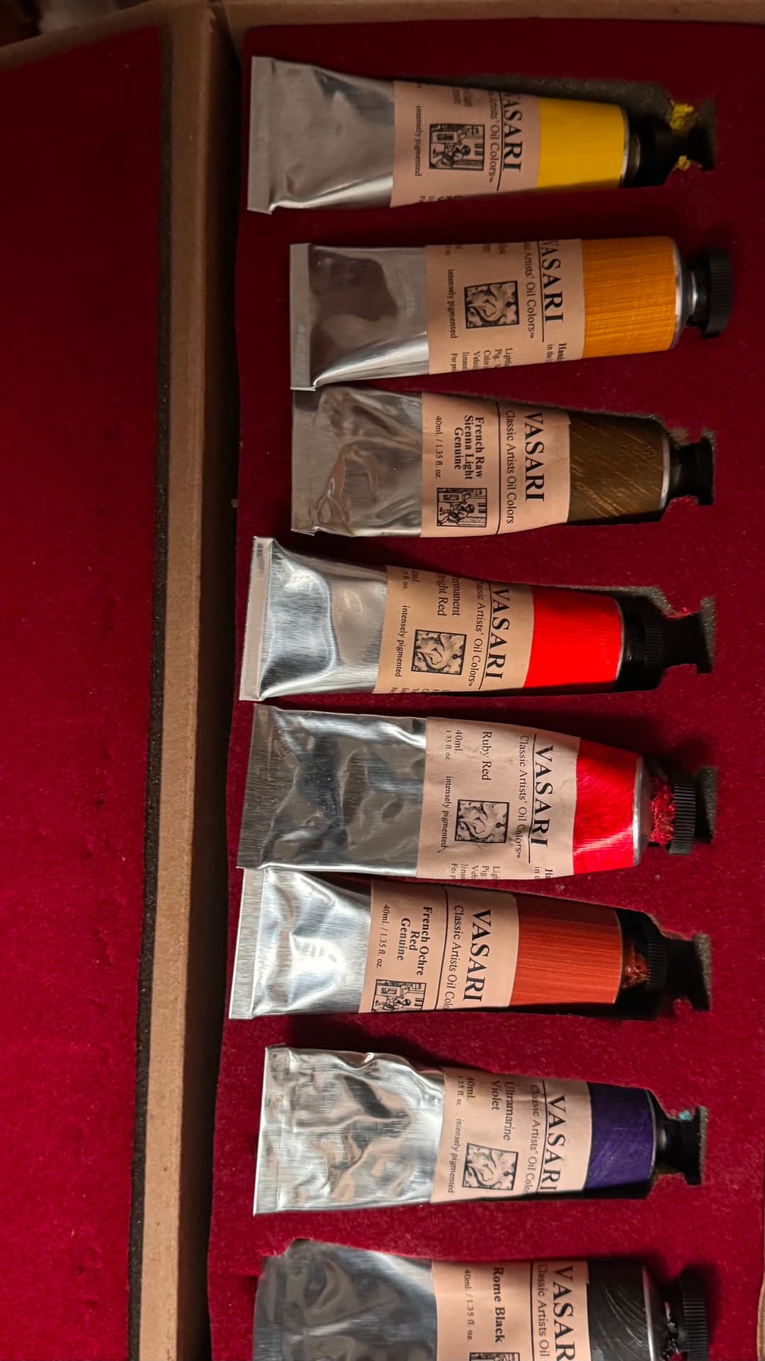
A handful of paints that have been on Tummins palette recently. Vasari's Brilliant Yellow, Yellow Ochre, French Raw Sienna Light Genuine, Permanent Bright Red, Ruby Red, French Ochre Red Genuine, Ultramarine Violet, and Rome Black. Photo courtesy of the Artist
Tummins on being drawn to Landscape
Inspiration that didn’t depend upon a light effect or on some grand vista
For Tummins, the question of "Why Landscape?" is like asking why you love someone. Tummins uses the language of friendship, of brokenness, of healing. For Tummins, inspiration doesn't depend on capturing the light or a stunning vista, and perhaps that is one of the things that make his paintings uniquely attractive.
What are some of the things you look for in the subject matter when you’re painting?
"Currently, it is landscape, but what about the landscape? Why the landscape? That’s tough to answer because it’s like asking why you love someone. What I can say is that I grew up with a large extended family and three older brothers, but I was alone most of the time. I would walk across the road, through the field, past the ponds, to the creek. It was just my thoughts and me. Having no expectations means that inspiration didn’t depend upon a light effect (though they are wonderful), or on some grand vista (which I never had).
I would see tiny, eraser-sized flowers at the base of the broom sedge, mossy patterns on rocks, the mesmerizing, golden bottom of the sunlit creek, minnows sparkling, fall leaves caught in a side pool - anything at all can be inspirational if you are thankful for it.
So what do I look for in the landscape? Nothing. I look to be present and grateful."

Seth Tummins, Night Crossing, 14 x 22 in., oil on linen. Photo courtesy of the artist.
Palette Quiz
What draws you to landscape?
"I have always sensed an 'Other' present in nature. While I was alone most of the time, I believed in God, and that made all the difference. I didn’t have the mindset that nature would provide everything I needed, but I found a broken system and recognized the same in myself. The landscape wasn’t a teacher as if I were a student of it. It was a friend who was a bit wounded and broken like I was. It pointed me to one greater. Though some would see only the materialistic 'nature, red in tooth and claw', I saw a hurting world that wanted healing. Perhaps that’s what drew me to the landscape."
We love to ask painters a palette quiz about their preferences.
Palette Quiz
Which colors would you consider essential to your palette? I only use Vasari. Ultramarine blue, Permanent Bright Red, and Brilliant Lemon.
What color has been on your palette the longest? Ultramarine Blue.
Quinacridone or Cadmium (if you had to choose)? Quinacridone…probably.
All time favorite brand overall? Vasari.
Favorite white paint? I love lead white, but I would have to be buying it constantly, so I mostly use M. Graham’s fast-dry white (not Vasari. I know…)
Zinc? It may be fine in certain proportions. Didn’t Van Gogh use it a lot? I don’t know. I saw the bad press it got, and while those who produced it are reputable, I would like to see a bit more.
Lots of paints on your palette or very few? Many times, I have a white, a couple yellows, a red, and a blue. Maybe I’ll add a convenience mixture or two, but I begin simply and try to go as long as I can until I’m unsatisfied. Then I’ll add different things to experiment.

The Seth Tummins Vasari Set. Photo courtesy of the artist.
The Tummins Top 7
If you could only pick six colors (brand and paint name) what would they be? Rome Black, Ultramarine Blue, Transparent Red Oxide, Permanent Bright Red, Yellow Ochre, and Brilliant Lemon. All Vasari. (And White)
Which colors came as a breakthrough or revelation to you? Ultramarine violet. Also, the combination of ultramarine blue and transparent red oxide. I had no idea how to make a dark when I started. Blew my mind. The cobalts - I don’t use them much, but when I do, I always wish I had the large tubes. So beautiful. Any bright, warm blue like cobal teal, turquoise, or alpine green extra pale. The mixtures they make are so vibrant and beautiful.
Favorite Convenience blends? Vasari is stacked in this area, and I have many of them that I use, so picking a favorite would be hard. I’ll choose Ruby Violet Light and Shale, but I use a lot of them.
Feelings about Phthalo blue? It’s like anything else - just learn to use it or buy it in a tint or the lesser strength. I don’t use it straight. I use it in convenience colors.
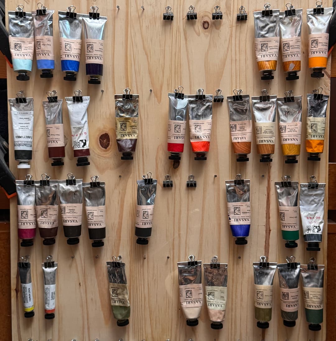
Seth Tummins' paint setup. Photo courtesy of the artist.
The Tummins Top 7
What was the most recent paint color you bought? Turquoise.
What is the extinct color you miss the most? I don’t miss anything, but I’m fearful for the loss of other ultramarine colors.
Your favorite earth tones? Yes. 😂
Are there any colors you mix and tube yourself? Heck no.
How long did it take you to arrive at your current palette? How many iterations of your palette have you gone through? I have use a version of a split primary palette since nearly the beginning. It is simple and can do general landscape stuff without issues.
What’s your favorite paint color? / Do you have a fondness for any particular color? I don’t really have a favorite color, but turquoise, alpine green or any gem-like blue would be a front runner.

Vasari paints in Seth Tummin's studio. Photo courtesy of the artist.
The Note of Mystery- Beyond Triads
That they "...may know more fully that we lived and thought of them enough to leave something of worth."
Perhaps that is part of what makes Tummins' work so good. He goes beyond-- beyond the seen, beyond the surface, beyond the triad. Even while talking about triads, he mentioned an important "however." It's that openness to the "however," that makes his work so interesting. It is fascinating to see landscape work that uses Phthalo tints successfully, and also knocks pieces out of the park.
"I like to experiment, so I may grab something else to be a dominant theme (one of their Phthalo tints (Alpine Green Extra Pale or Video Blue Extra Pale). I might use Video Blue Extra Pale as the white predominately. I may use Cadmium Yellow Orange straight out of the tube as a bounce for ideas and proceed to cover it with Ship Rock or Silver Point."
Ship Rock and Silver Point are both Scott Christensen grays, which were long rumored to contain Cadmium Yellow.

Seth Tummins, Plenty Coups Peace, 20 x 20 in., oil on linen. Photo courtesy of the artist.
Call-outs from the Seth Tummins Vasari Set
Experimentation
An Exercise in Seeing Purple
One of the key colors of the Palette
One particular paint on the palette deserved special mention, namely Ultramarine Violet.
Many impressionists and landscape painters hint through the ages that the envelope of the atmosphere is purple.
One can identify this pigment as PV15 on the back of the tube-- more information can be found in the Pigment Notebook entry for Ultramarine Violet. The color of any given Ultramarine Violet sample can be anywhere from a dull magenta to deep purple to an indigo, but the one Tummins prefers is the note struck by Vasari-- a rich, deep violet. Despite the depth of color in masstone, Ultramarine Violet is a gentle color and a subtle tinter, which is perfect for muting other colors.
In regard to Ultramarine Violet being a uniquely useful color, Tummins said, "I use it as a modifier for green and browns like you might find on the ground and the dirt for dead grasses for water for basically anything. It is the modifier that I reach for first many times."

Ultramarine Violet- The Star of the Palette
The Purple World
Tummins proposed an exercise in seeing purples. "Here is an experiment for you," he wrote, "Put on your sunglasses when outside and when it’s sunny and just look at a just look around for a minute or so, but before you pull your sunglasses off, find one or two things to look at like a car a tree, a shadow or whatever it really doesn’t matter - before you pull them off say the word purple a couple times and then as you pull them off, say the word purple a couple more times."
In and around the regions of the West that Tummins features in his paintings, the grass may be a dull purple under the dome of the atmosphere. That is how it so often looks. But it isn't just the west-- Claude Monet himself praised purple. The need for dull muted purples is everywhere in landscape painting.
Tummins wrote, ""The answer for me is almost always purple- red or blue purple. The dead grasses, concrete, silver greens, water - purple is the answer. It is the world, it seems to me."

Seth Tummins, West to Cody, 4 x 9 in., oil on linen. Justin Vining Invitational. Photo courtesy of the artist.
Tummins' Home
A Whispering Beauty-- Middle Tennessee
Tell us about some of the places you’ve painted and what captures you about those places. What did you notice, what did you feel.
"Painting is hard for me, so I don’t “enjoy” the process very much. It is hard for me to paint when I am excited, so I just end up walking/driving around being content with being free. Painting is a good practice, however, and important to do.
That said, in Middle Tennessee, I’m just at home. I don’t have grand vistas or overwhelming scenery. I have hay bales, barns, and creeks. I also have a love for this place. Ours is a whispering beauty that invites as opposed to intimidates or instills awe. Even so, I will never paint a picture that encapsulates my home."

Seth Tummins, Story Arc, 12 x 20 in., oil on linen. Photo courtesy of the artist.
Tummins on the West
Another World
"As for the West, what can we say? It is another world. The variety is wonderful to me. The sheer scale raises a person’s desire for freedom. I have stood alone in Wyoming - not a soul or sound for many miles, accompanied by only the wind - and felt totally seen. I crossed the Colorado line headed towards Taos, New Mexico at night, and just before the darkest dark I have ever been through (tied with Wyoming, but scarier because of the heavy rain…), I drove near a mountain that seemed to be a person - not in its appearance, but in its presence. I could not stop looking at it.
While I know little of my home and less of the West, I know what home feels like, and I search out whatever gives me that sense. Not because it is more beautiful, but because it and I have a kinship, it seems."

Seth Tummins, Jacob's Rest, 14 x 22 in., oil on linen. Photo courtesy of the artist.
Perfect Color Notes
A Deeply Resonating Chord
Tummins' particular take on landscapes from the West arrested my attention-- something about the look, the chords of colors, the arrangement and the stillness of those vast wilderness mountains in Wyoming. If you know this band of Rocky Mountains, you'll know how rarely its language is captured with this degree of attunement.
This stretch of the Rockies happens to be similar to the look and feel to the Rockies in Colorado as well-- the look from inside those mountain basins. The way the color behaves, the low hills, the sagebrush, the green-black of pine trees, the recession of hills, and in the upper right, notice the way the ribbon of distant mountains turns to bands of blue behind them. A nice subtle yellow to blue visual complement modulates from the foreground to the background. The way Tummins captured the color progressions is hard to find in paint.
In his premise, he wrote, "May you find that it is, in fact, the expression of a deeply resonating chord that wishes for others to awaken to its resonance and join in the kind of life that can only grow from gratitude."

Seth Tummins, Hazelton Road Study, 7 x 9 in., oil on linen. Photo courtesy of the artist.
Teepee Ring and Bear Paw Battlefield
""...May you find that what unfolds is more than a record, though it is at least that."
"Still, in my mind’s eye, I show up in these empty places filled with the weight of memory and listen."
Maybe it is Montana. That wind. Those fields. It's incredible that Tummins can paint something that goes far beyond photography. I can almost hear the wind as I look at it. In his writing on this piece, Tummins begins,
"There is nothing there, so I feel the need to explain."
So begins his writing. A person almost feels that they should speak quietly, even when discussing this painting.

Seth Tummins, Teepee Ring, 18 x 36 in., oil on linen. Photo courtesy of the artist.
This place, near Bear Paw Battlefield, also contains traces of habitation from a tribe that perhaps stayed there over 600 years ago. Two layers of overlapping history-Chief Joseph and the Nez Pierce, and the former unknown occupants who traveled there. To those, a third layer is added- we are there as well, with Tummins, as the viewer of the scene.
A theme in the writing which is echoed in the composition is "No where to go."
He wrote, "The grass was windblown, but someone had walked through the circle and into the distance, leaving the pressed-down grasses shining. No trace of a person. Just footprints."
"It is as if the wind wanted to speak, to tell all it knows, but when the few who venture here and turn their face to listen, the words soften to whispers, and are carried away."
More on the layers of meaning in this piece can be found here.
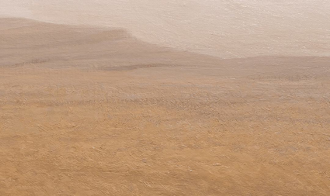
Seth Tummins, Detail of Teepee Ring, 18 x 36 in., oil on linen. Photo courtesy of the artist.
As Tummins describes the composition, he wrote, "...Despite the movement through this landscape, some reach a point and there is nowhere to go..." More may be found on this theme in his Writing.
He continues, "It was this utter simplicity - this deeply human experience - shelter, walking, time overlapping space - and the element of memory that compelled me to translate the shapes and tones into oil paint, and perhaps to place before whoever views it..."
Tummins' work focuses on the surface as well as the view of a painting, and this can be seen in the textural detail of this piece. "I respond to the surface as much as I follow a reference. So if I see a shape or texture that I like, I might reform the whole thing around it..." He went on to say, "I am as interested in the surface as I am in the subject most times...The surface is a key part to my satisfaction with it, and because things mix on the surface many times you can see why I would have colors chosen in my palette from Vasari that allow me to answer questions that my standard palette does not pose to me."

Seth Tummins, Detail of Teepee Ring, 18 x 36 in., oil on linen. Photo courtesy of the artist.
Featured Paints from Seth Tummins Palette
Remember Your Why
Tummins wrote, "Remember your why and rediscover yourself. Your why will be a mirror unto yourself."
From the dusty pink horizon lines of Wyoming, to the enchanting chords of the fire-scorched Bighorn Mountains, to stretches of windswept Montana, rich with history, Tummins taps into the Spirit of the West, the language of the wind, the stillness of its sunsets. Tummins' colors create portal to a new view of the land, a new introduction to history, an invitation from the "Other," and a personal encounter with painting.
Tummins' work has been featured in the Coors Western Art Exhibit and Sale and has been featured in Fine Art Connoisseur Magazine. His achievements include the Olmstead Founder’s Award in 2024, and Best of Show at SAGE Community Arts in 2022. View his work at SethTummins.com, or follow him on Instagram.
Want to hear more about artist's palettes, pigments and paint news? Sign up for our newsletter.
Article Written by Melissa Carmon

Seth Tummins, Ten Sleep to Meadowlark Lake, 10 x 16 in., oil on linen. Photo courtesy of the artist.
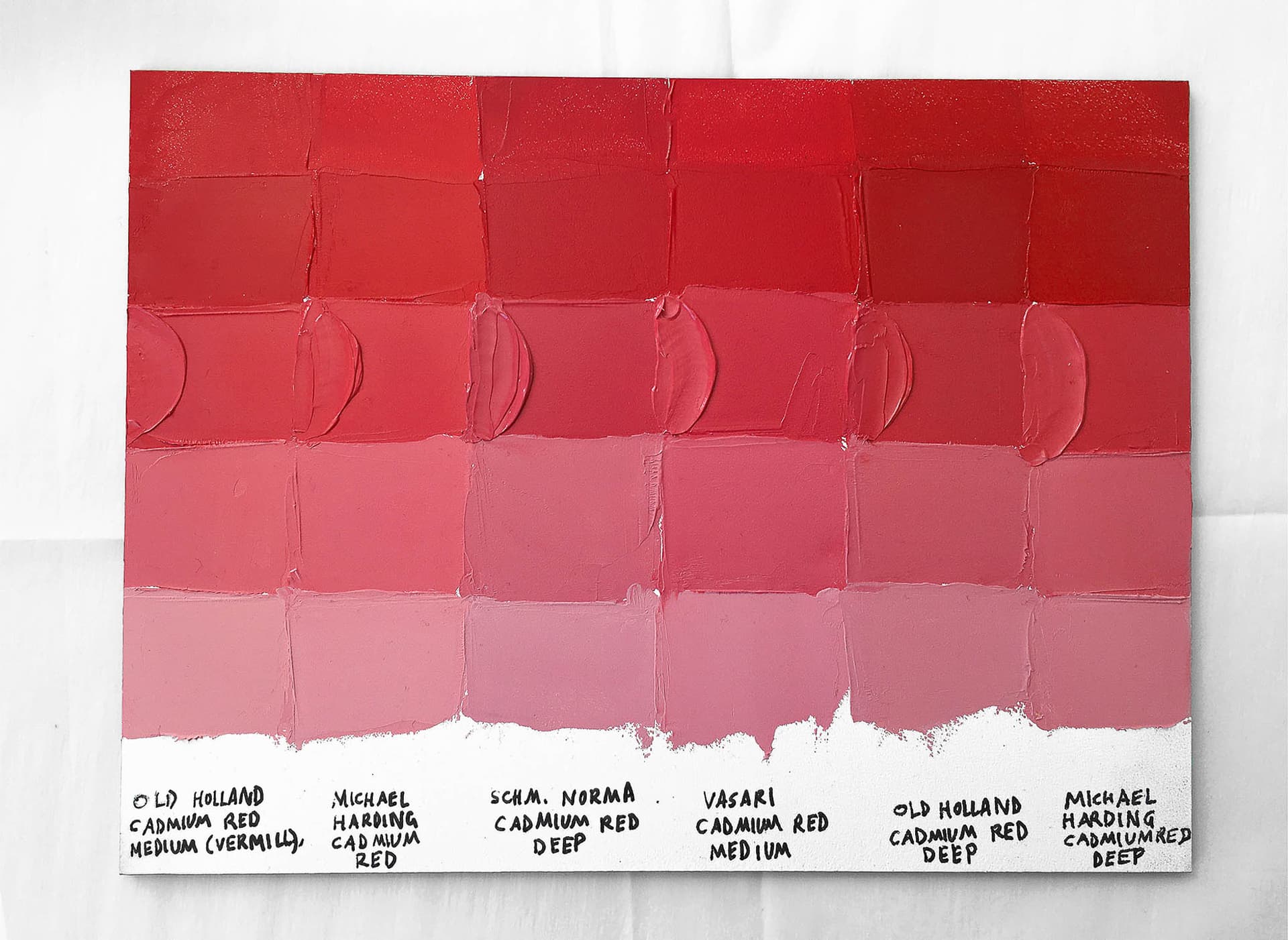
Cadmium Red Deep and Cadmium Red Medium Color Comparison and Review
Deep and Brimming with High Chroma, Let's Compare Best-in-Class Cadmium Reds
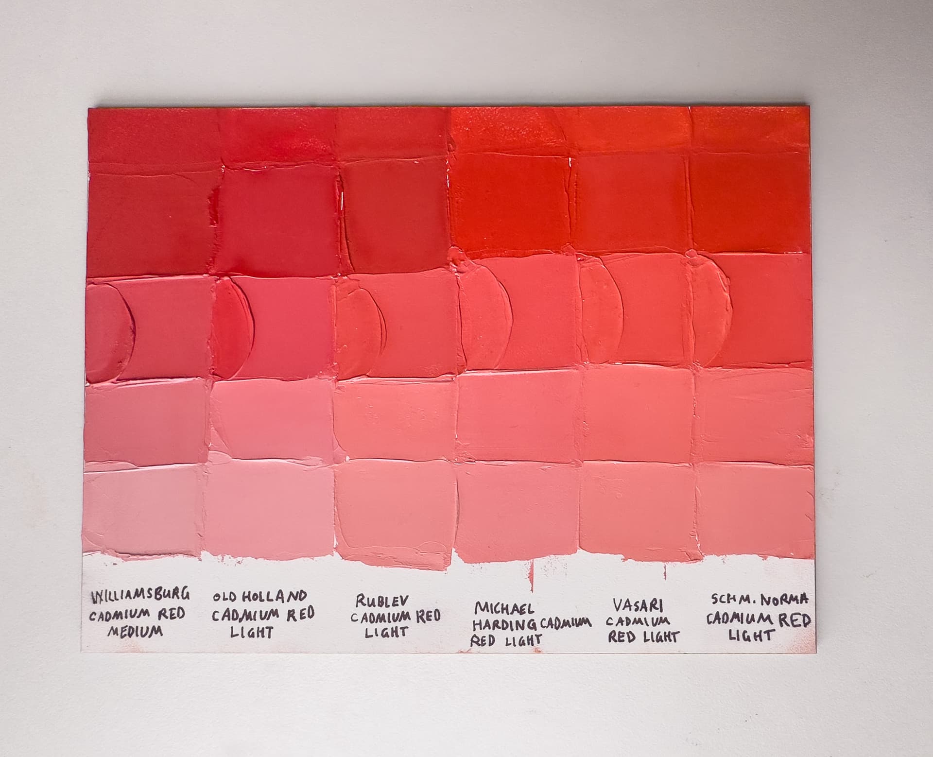
Cadmium Red Mediums vs. Cadmium Red Lights- Premium Oil Paints
World-Rocking Reds Worthy of a Matisse or Kandinsky
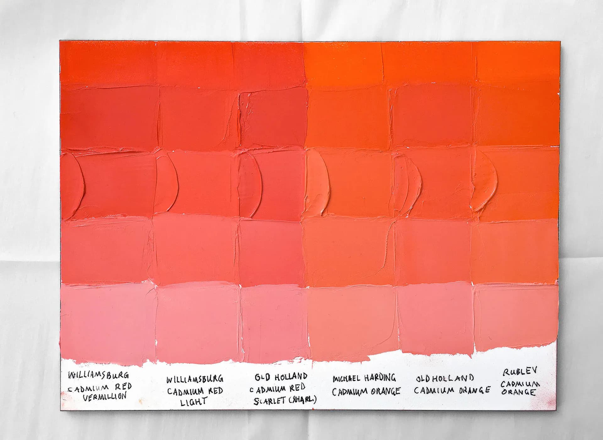
Warmest Cadmium Red Lights vs Cadmium Red Oranges Oil Paint
Where Cadmium Red Light Begins and Ends: a Spotlight on Some of the Warmest Cadmium Reds and the Reddest Cadmium Oranges
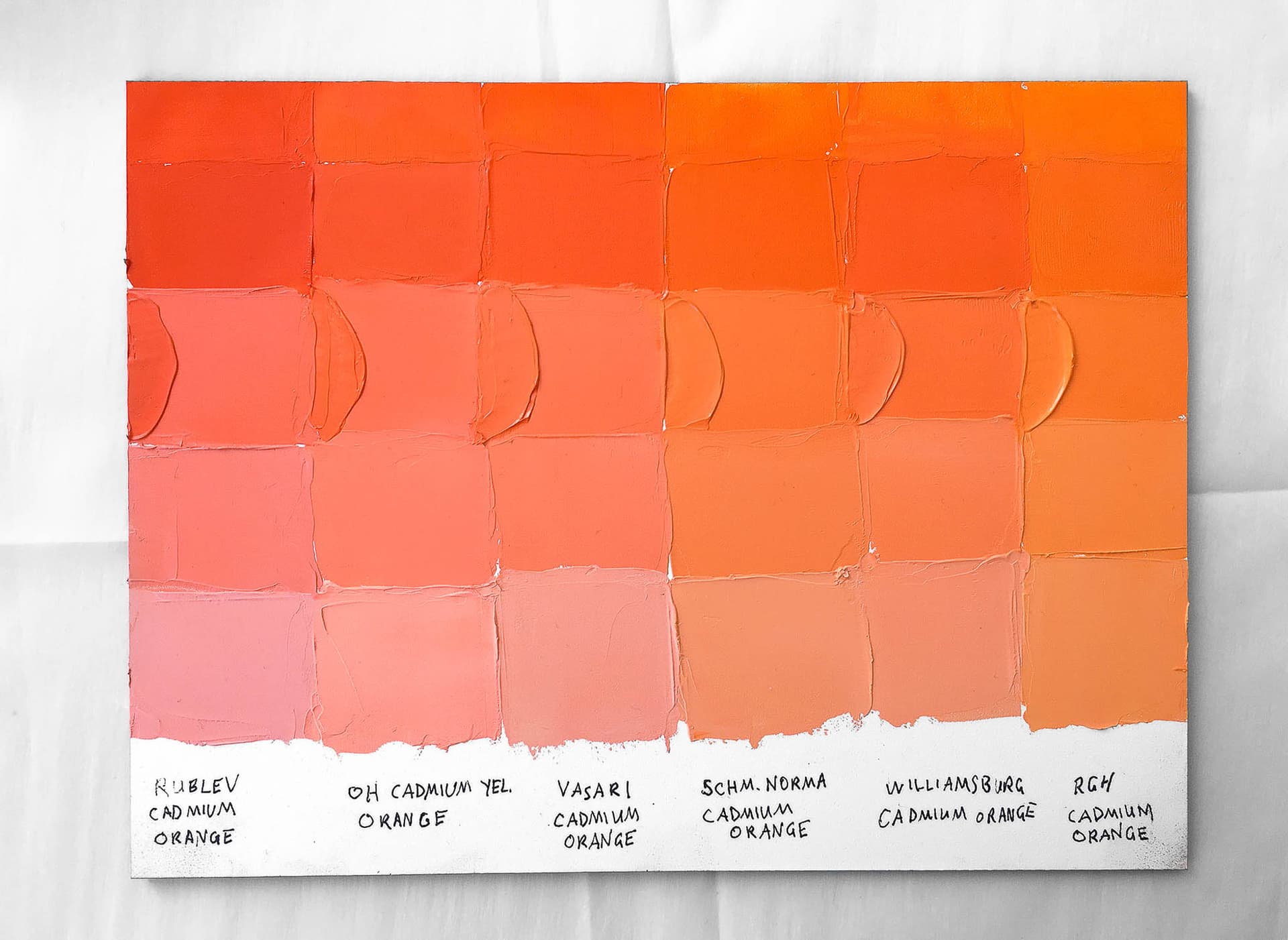
Cadmium Oranges Oil Paint Color Comparison and Reviews
The Must-Have Color on Your Palette You Never Knew You Were Missing
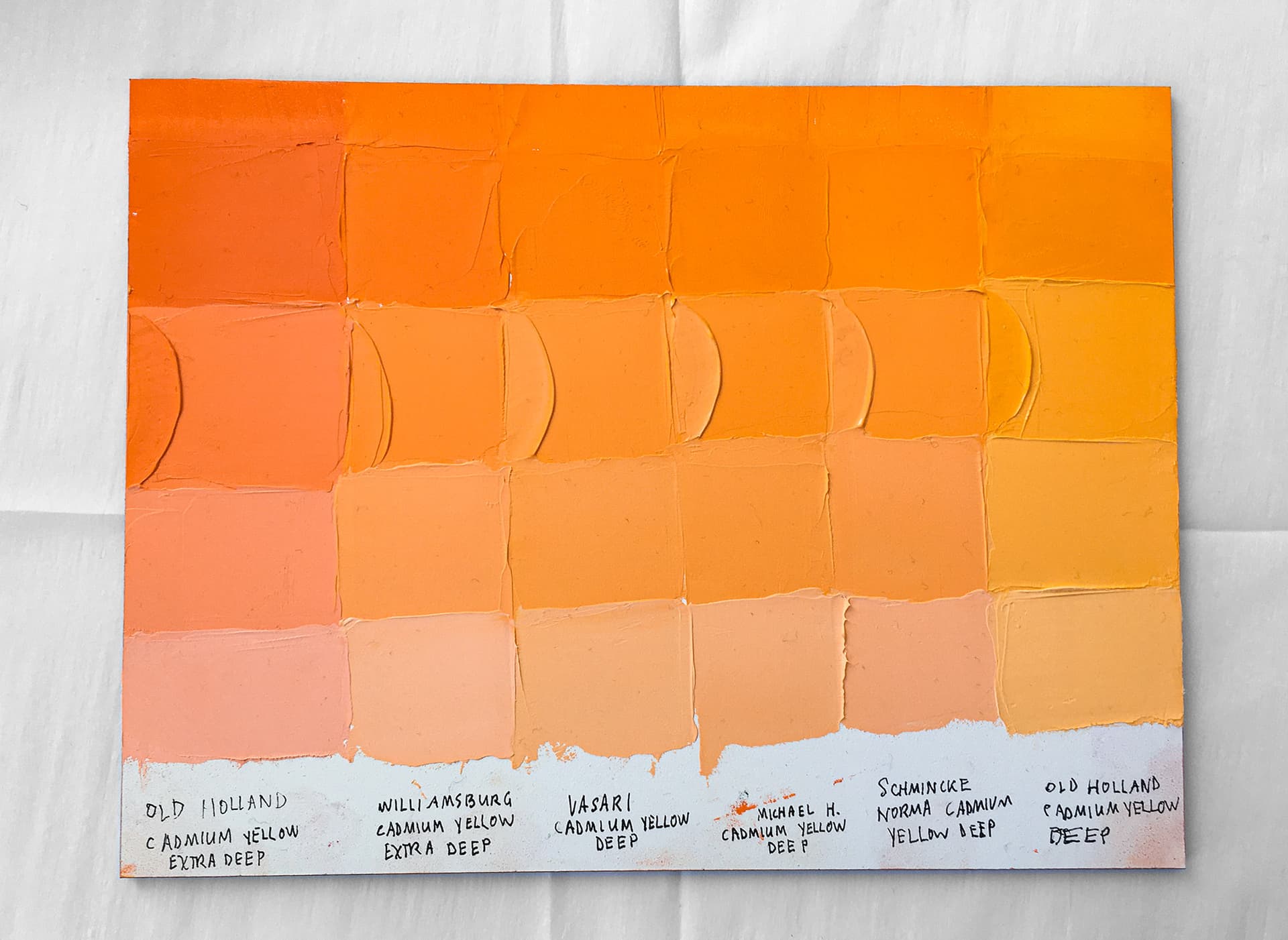
Cadmium Yellow Deep Oil Paint Color Comparisons
Somewhere Between Tangerine and Sunshine, These Cadmium Yellow Deeps Light Up Any Palette
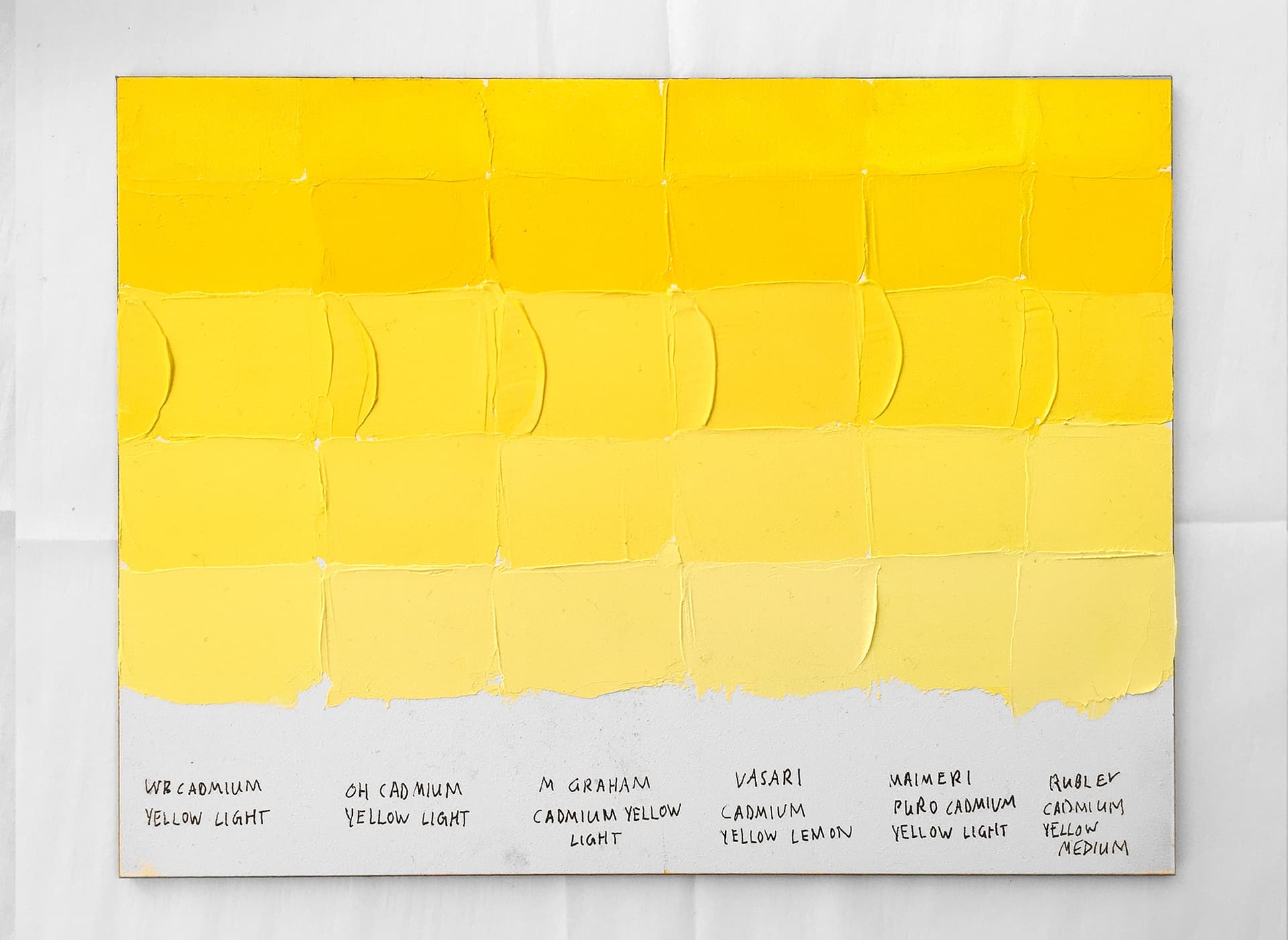
Cadmium Yellow Lights Artist Oil Color Comparison
These Collectible Cadmium Yellow Lights Make Unique Contributions to the Color Spectrum
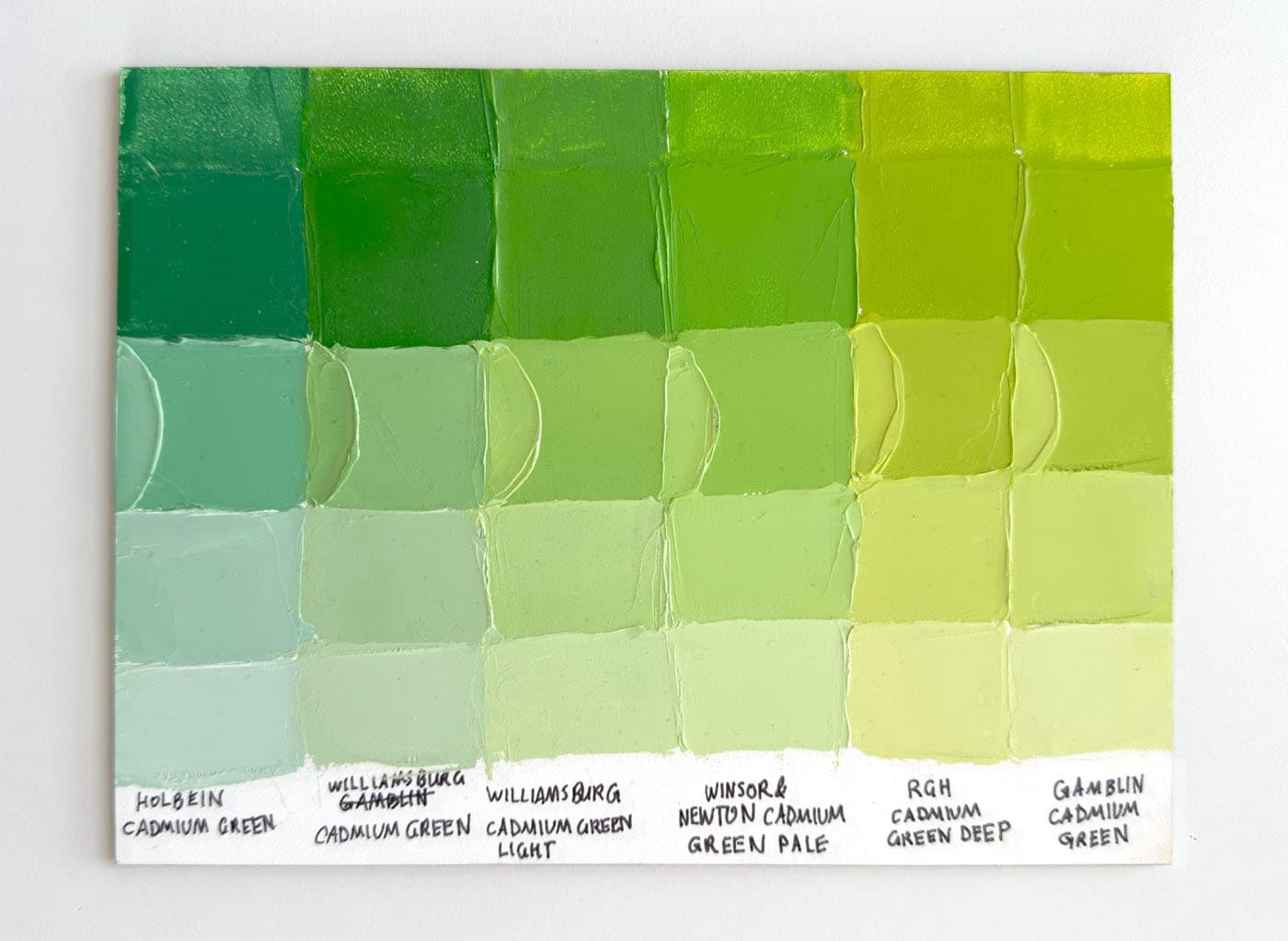
Cadmium Greens, a Comparison
Cadmium Greens span several hues- which one is best for your next painting?
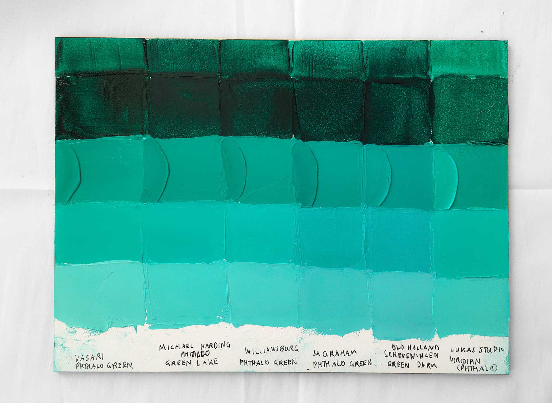
Phthalo Green: Beryl and Aquamarine Oil Paint Color Comparisons
Rich with Mystery and Mystique, The Best Phthalo Blue Greens Do Yield Some Surprises
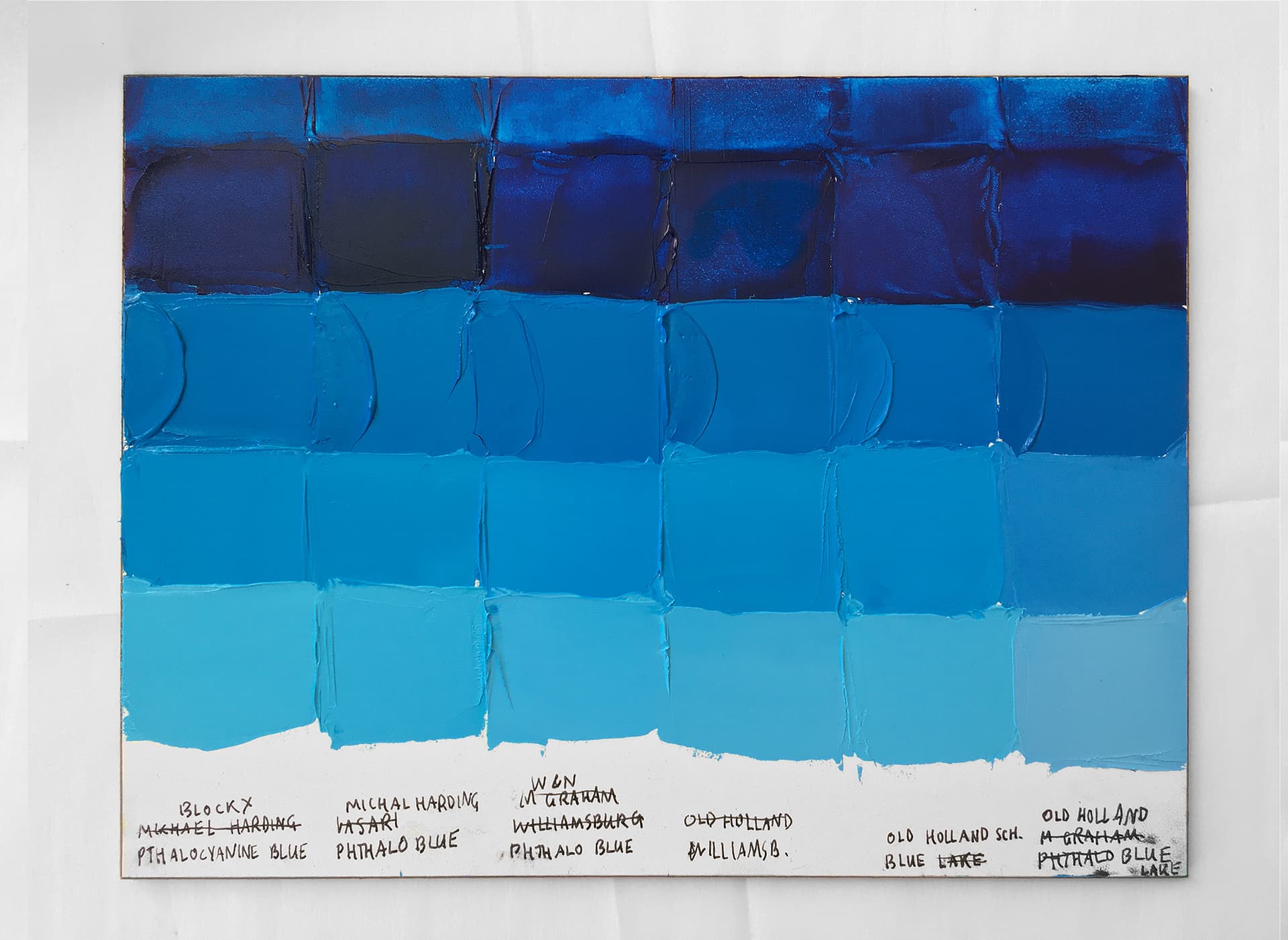
Phthalo Blue (Green Shade) Oil Paint Reviews
High Chroma Turquoise Here We Come! These Blazing Blues are Some of the World's Most Powerful Paints
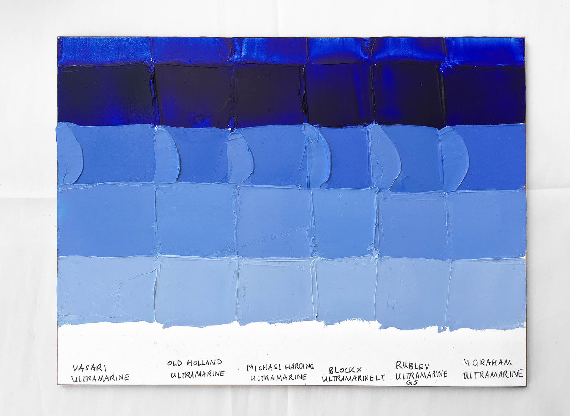
Ultramarine Blue Oil Paint Comparison
From A Word Meaning Over the Sea, these Deep Blue Beauties are an Old-World Painter's Dream Come True
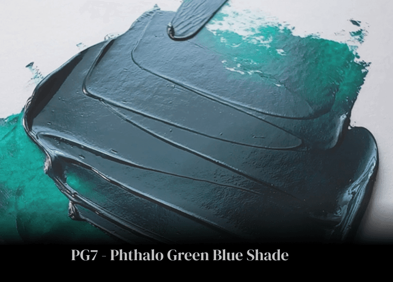
Phthalo Green Blue Shade PG7
The essence of green, this is an elemental gem of the palette
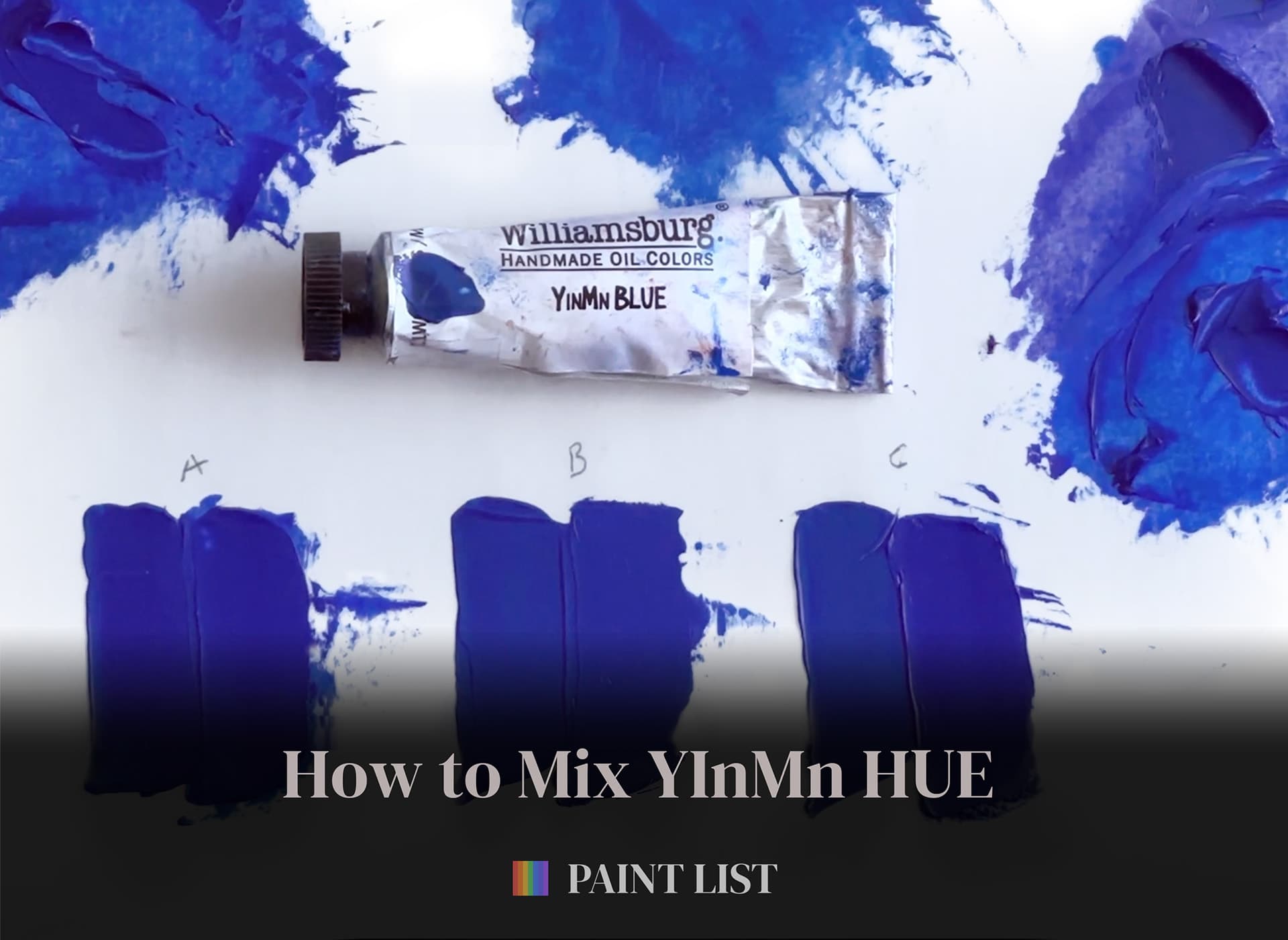
Mix Your Own YInMn Blue Hue, Part 1
Mix an approximation of this elusive paint with our three simple recipes. These mixes will get you close with paints you may already have in your paintbox
Williamsburg Oil Paint Review
With a Stunning Rainbow of Single-Pigment Paints, this Paintmaker Has Led the Way in Oil Paint Testing
Gamblin Artist Oils Review
Thick Impasto Paint and a White Paint for Every Occasion. Is Gamblin the Right Paint for You?
Limited Availability Pigments
Discontinued Pigments Can Lead to Discontinued Paints: The Recently Lost Pigments and How the Paintlist Can Help
Paint List Holiday Guide - 2023 - Oil Paints
It's the Holiday Season so we're taking a break from the studio to look at the best of what we see out there this year.
Unlocking the Palette with the Pigment List
A painter's secret superpower
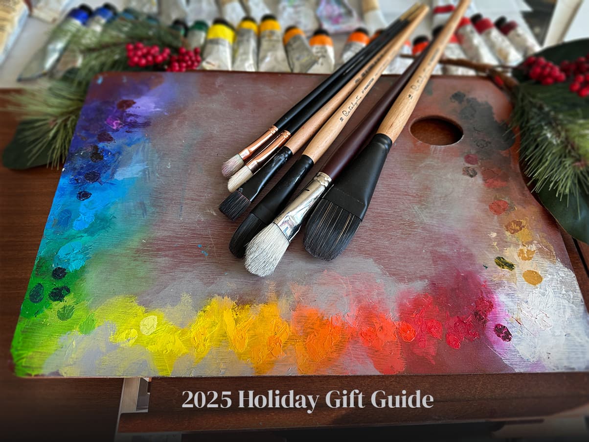
2025 Paint List Holiday Gift Guide - Oils
Dreamy Paint Sets, Enchanting Minis, and a perfect studio stocking stuffer
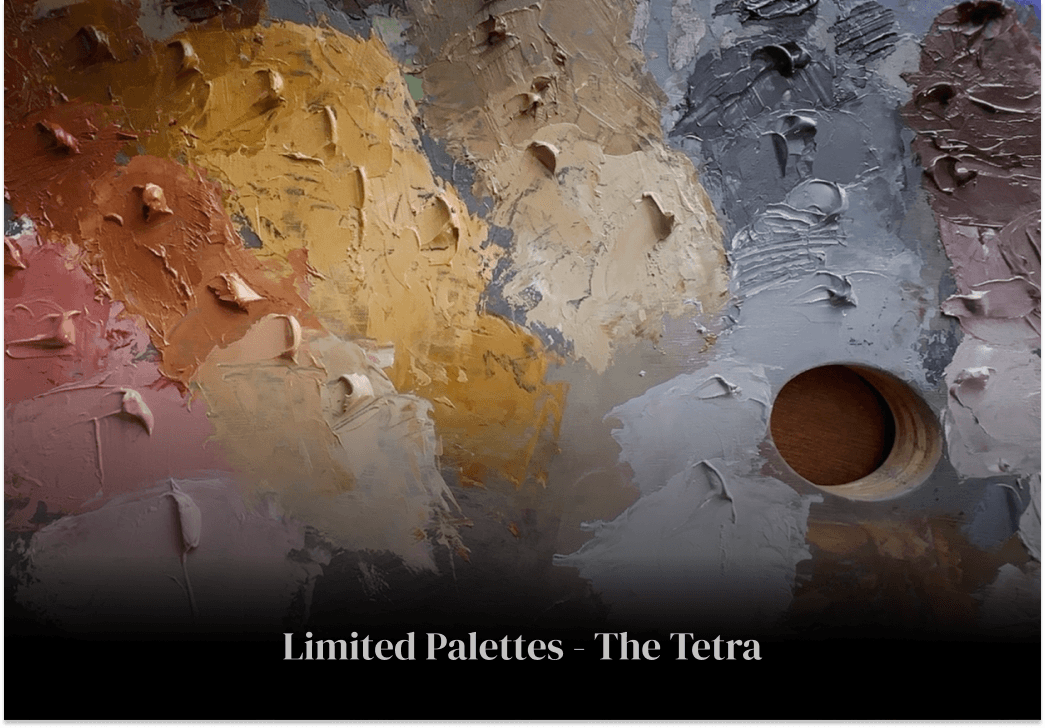
The Tetra, an Ancient Limited Palette
A super-limited palette with endless possibilities
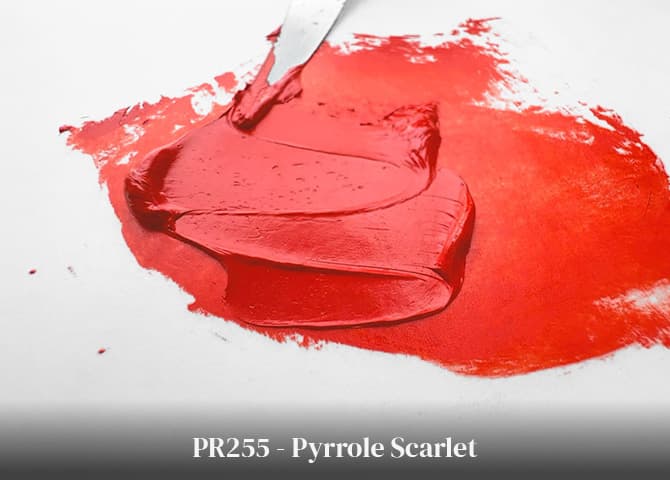
PR255 - Pyrrole Scarlet
Vivid and Versatile, this Feisty Red is Unparalleled in Tints
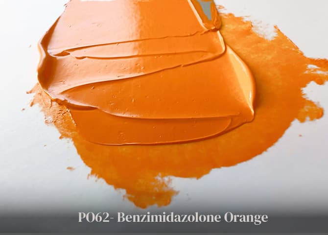
PO62 - Benzimidazolone Orange
With High Lightfastness and Semi-Opacity, this is a Yellow-Orange Worth Meeting
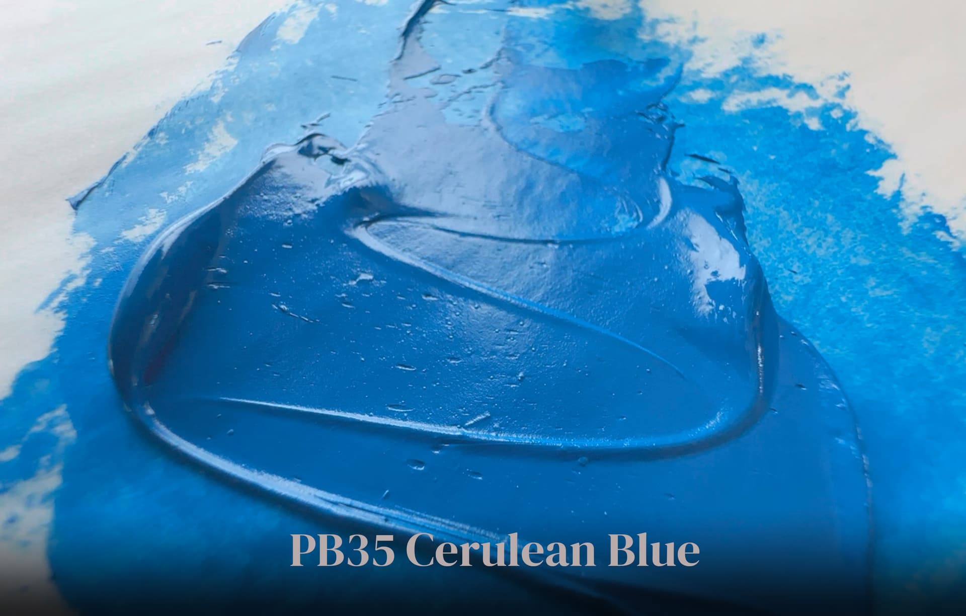
PB35 Cerulean Blue Genuine
Stable, Reliable, and Expensive, This Sociable Sky Blue is a Stellar Mixer
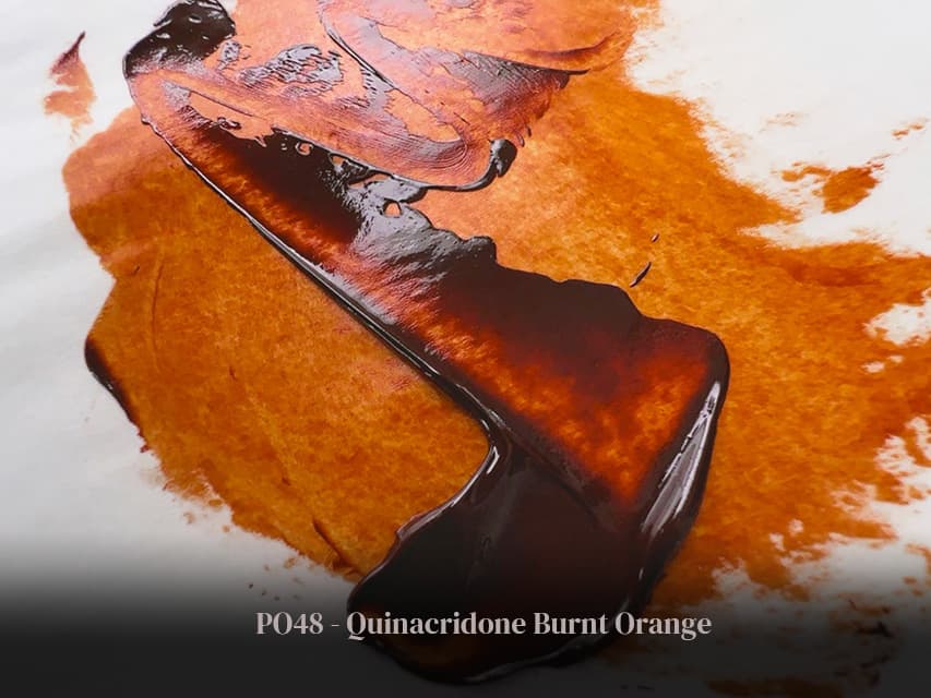
PO48 Quinacridone Burnt Orange - Extinct
Key to the Lost World of Botanic Browns
.png&w=1920&q=75)
Pigment Spotlight: Pyrrole Red PR254
From Pastel Pinks to Fast Cars: A High-Performing Lightfast Red
Find Your New Favorite Paints
Search Tips on Paint List to Uplift Your Palette
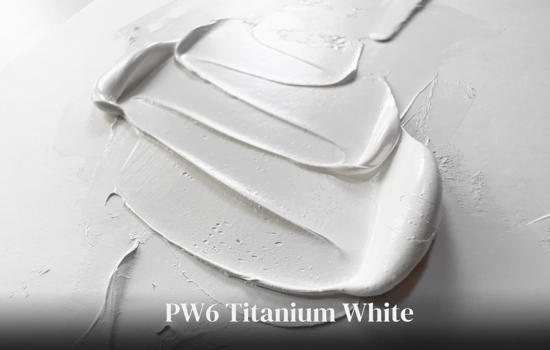
PW6 - Titanium White
This Ubiquitous Pigment is Cool, Inert, and Unruffled
The Exploratory Open Palette of Seth Tummins
His Vasari Set is Just the Beginning
PB15 Phthalo Blue
Meet This Excelsior Cyan In A New Way
PBr7 Natural Brown Oxide, And a Lost History
From Scarce Raw Siennas to Beautiful Burnt Umbers, Tales of Old Pigments Still Inspire
Guide to Oil Paint Brands
Think about brands in a whole new way
PB29 Ultramarine Blue
A Blue Forged in the Furnace, an Enchanting Blue Beyond Compare
The Great Book of Color
Saving the Lost Wisdom of the Painters
Fire Recovery Resources for Artists
When an unexpected urban firestorm hits your studio, here are resources
