This site is community-supported. We may earn a commission (at no extra cost) when you buy through our links.
PO62 - Benzimidazolone Orange

PO62 - Benzimidazolone Orange

With High Lightfastness and Semi-Opacity, this is a Yellow-Orange Worth Meeting

Featured Paints

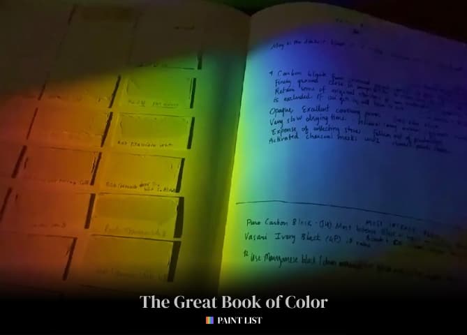
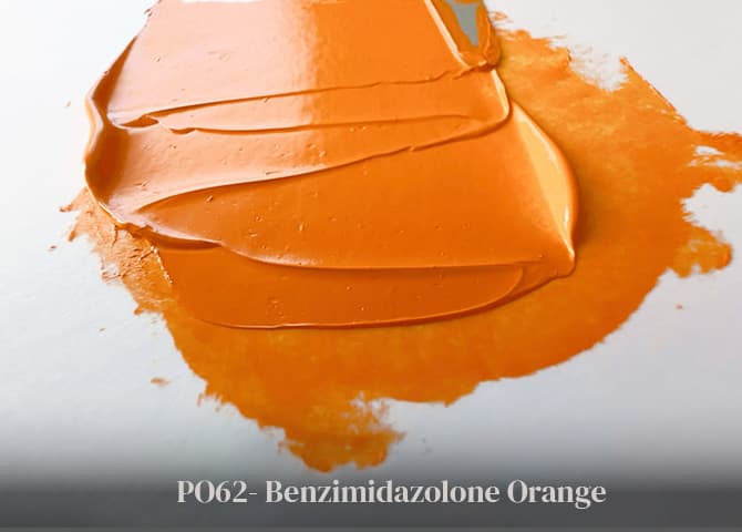
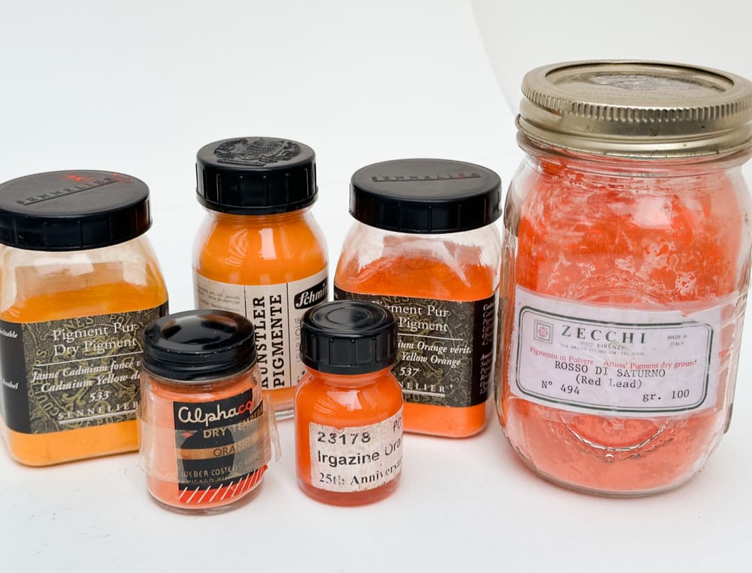
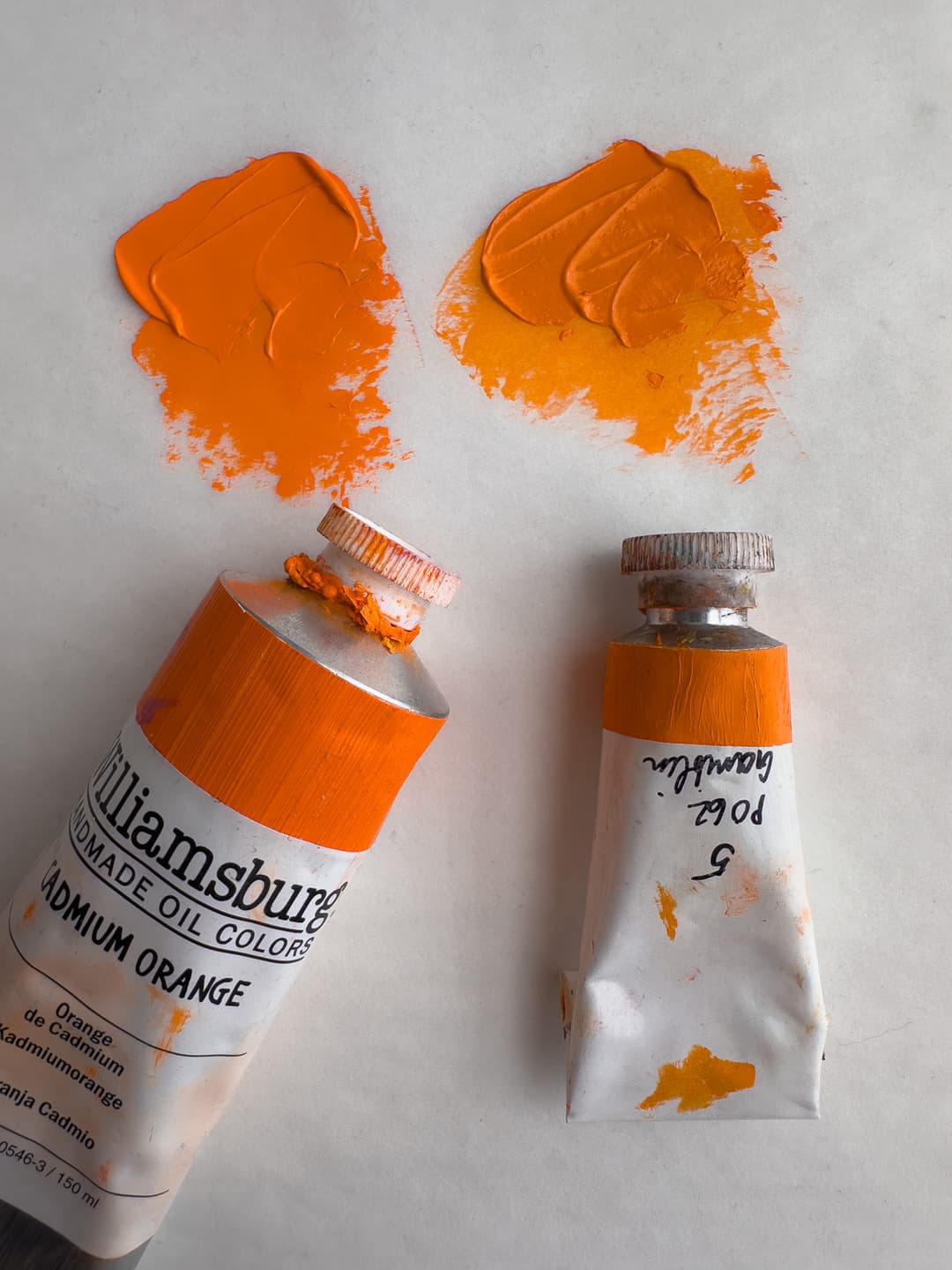
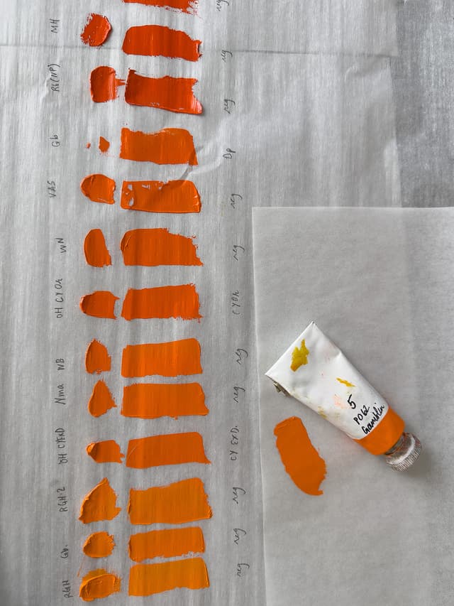
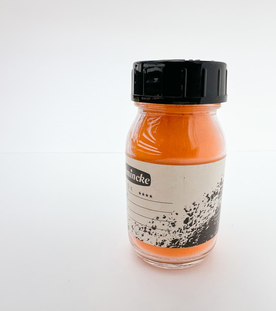
The metal tubes of paint glistened subtly under the fluorescent lights in the paint aisle, with each uniform tube neatly hung in a row. I scanned through the titles, like Hansa Yellow Deep, then Transparent Orange, and turned over each one of the vaguely named tubes of yellowish-orange paints to look for the pigment information on the back. I was on a mission to find one pigment in particular, PO62. The tube marked Permanent Orange looked promising. Finally, there it was, a single-pingment Benzimidazolone Orange-- the only one in the store. PO62 can be a bit hard to find as only a handful of brands offer it as a stand-alone pigment.

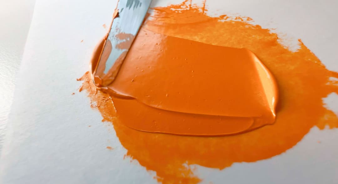
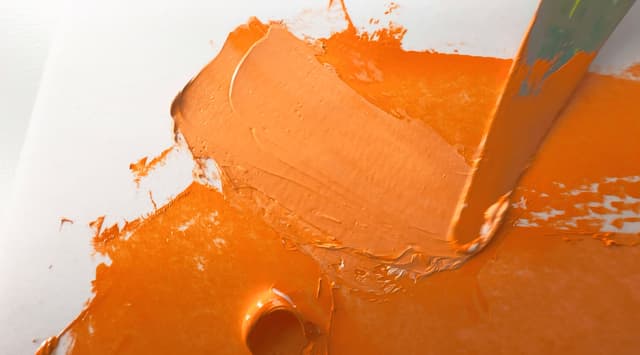
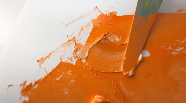
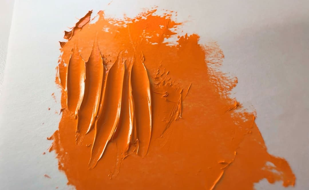
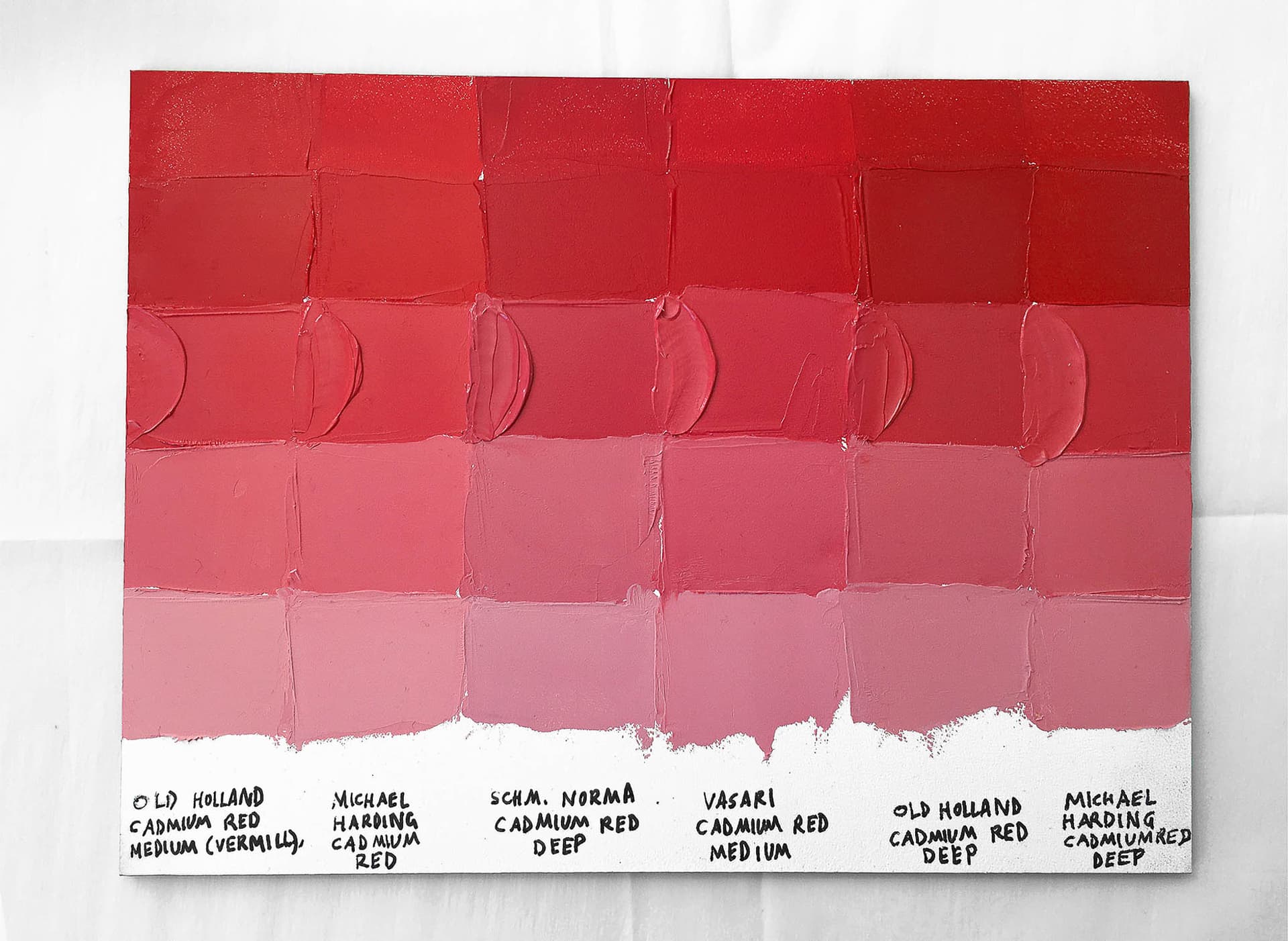
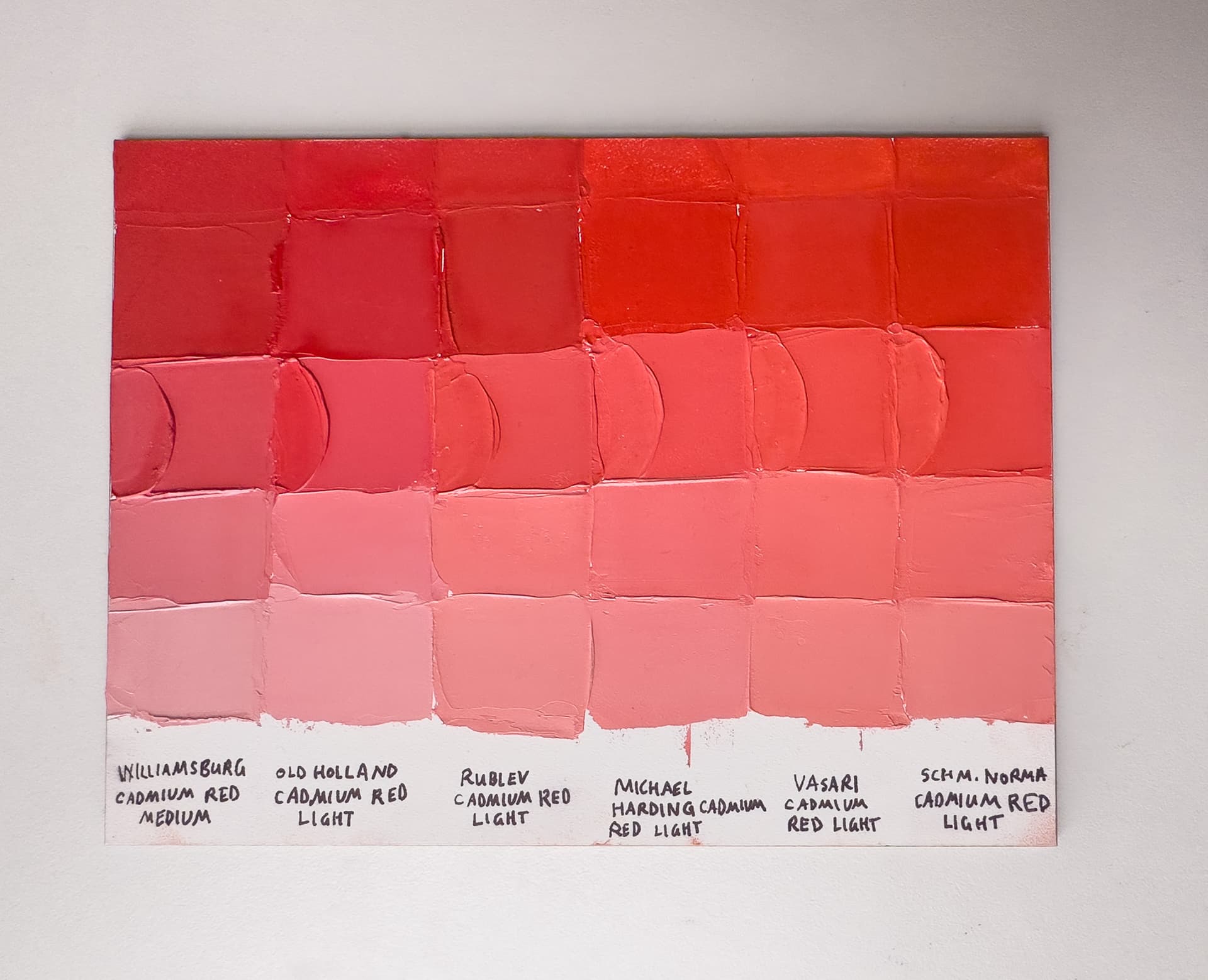
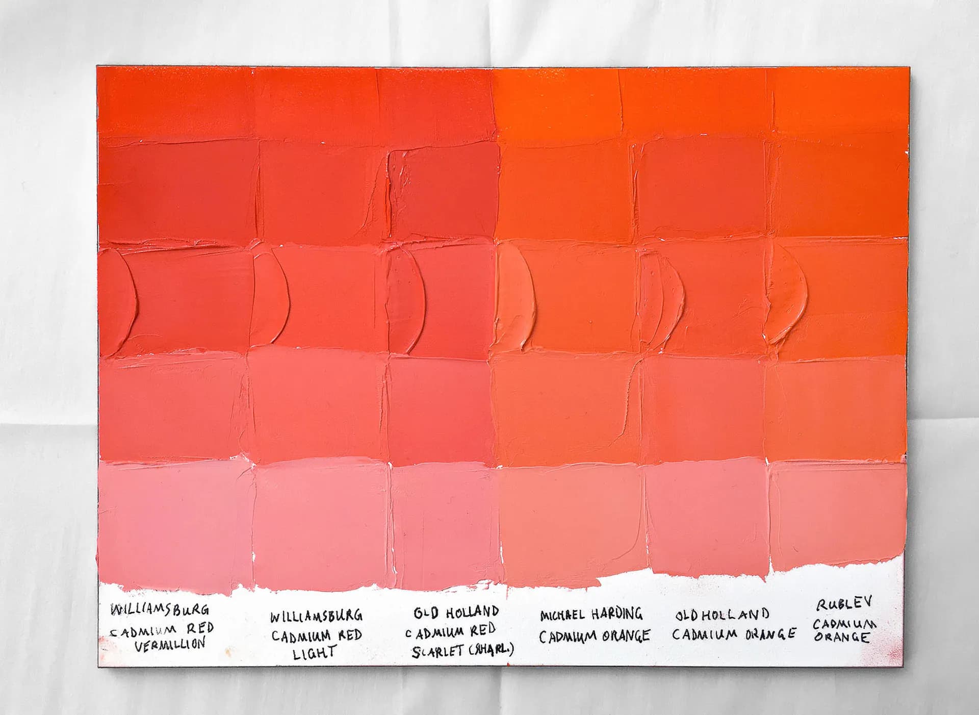
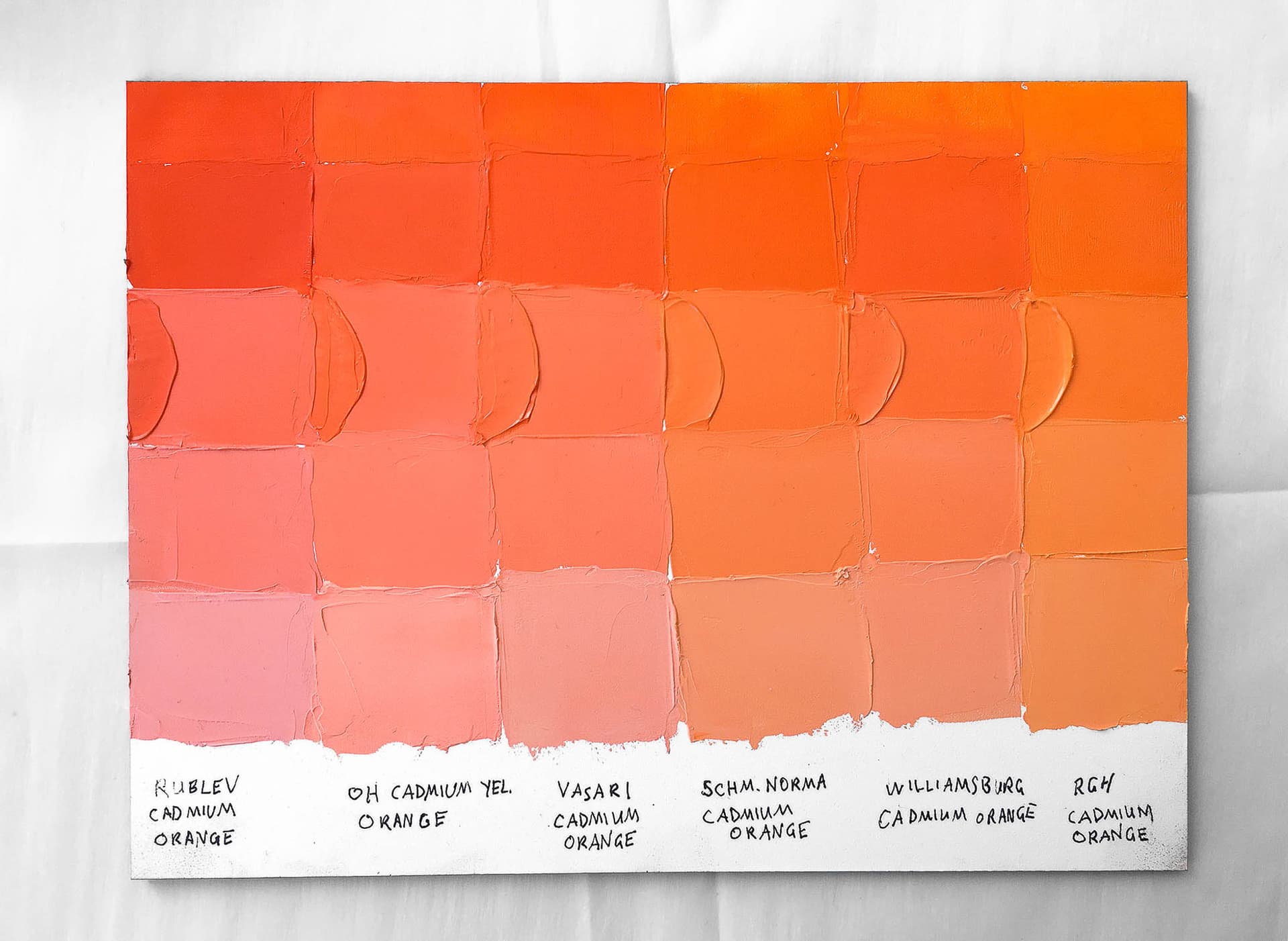
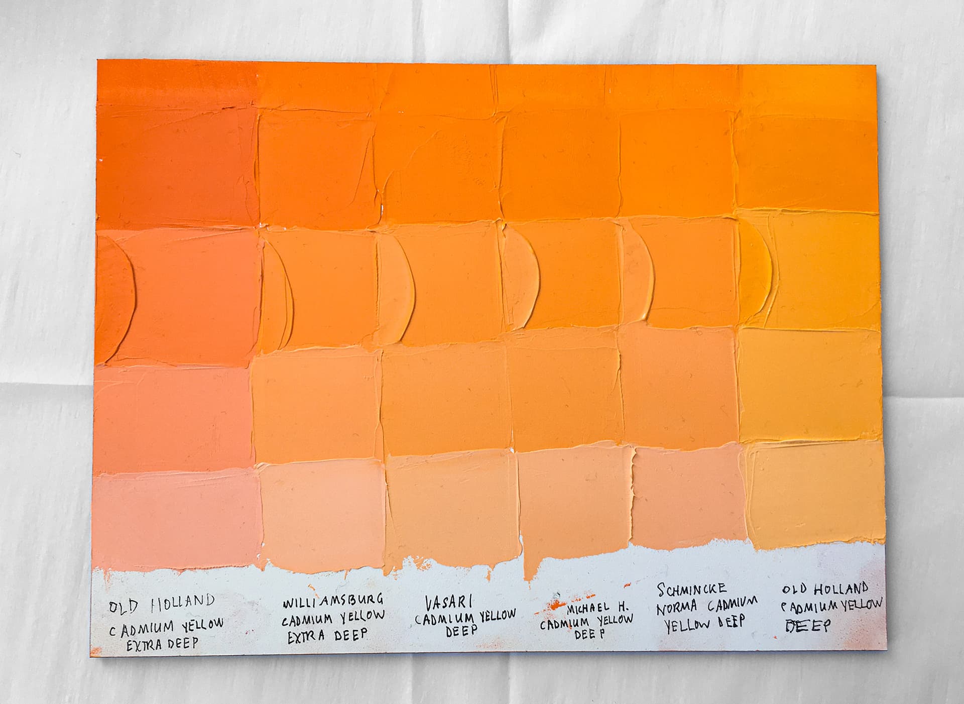
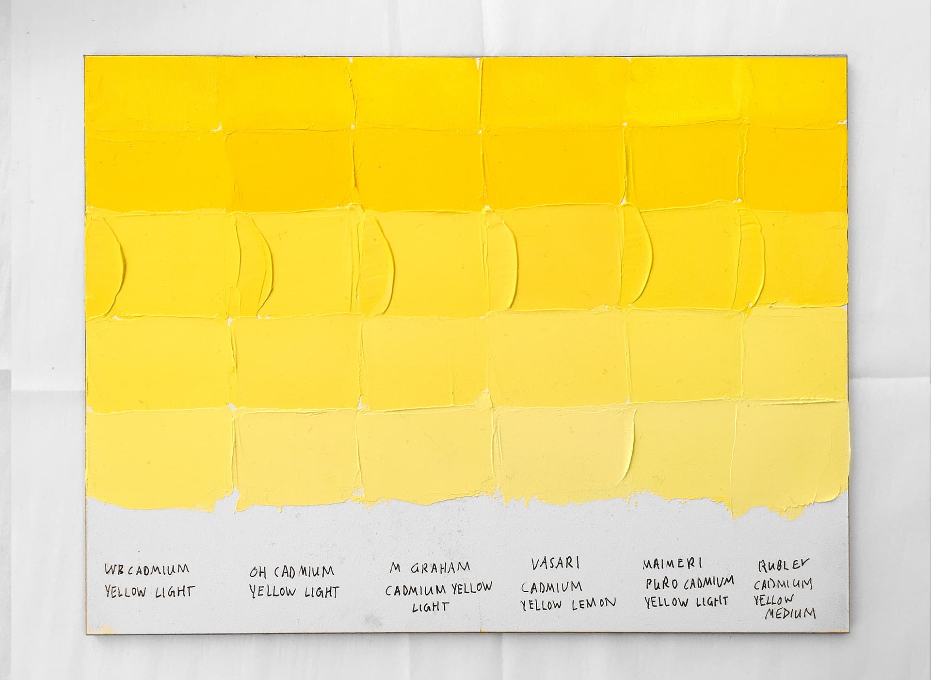
Back in the studio, I poured a pumpkin orange daub of this novel color onto the worn, greyed surface of a palette I'd had since my student days at RISD. The surface was rough with years of scraping down, cleaning, and adding new paint. On the grey palette the Benzimidazolone shone brightly. However, when set next to the finest-quality cadmium oranges, of which I'd grown quite fond, this orange had an odd note of desaturation to it. Taken in isolation, Benzimidazolone Orange looks incredibly bright, but set in an arpeggio of cadmiums, it looked a bit duller.

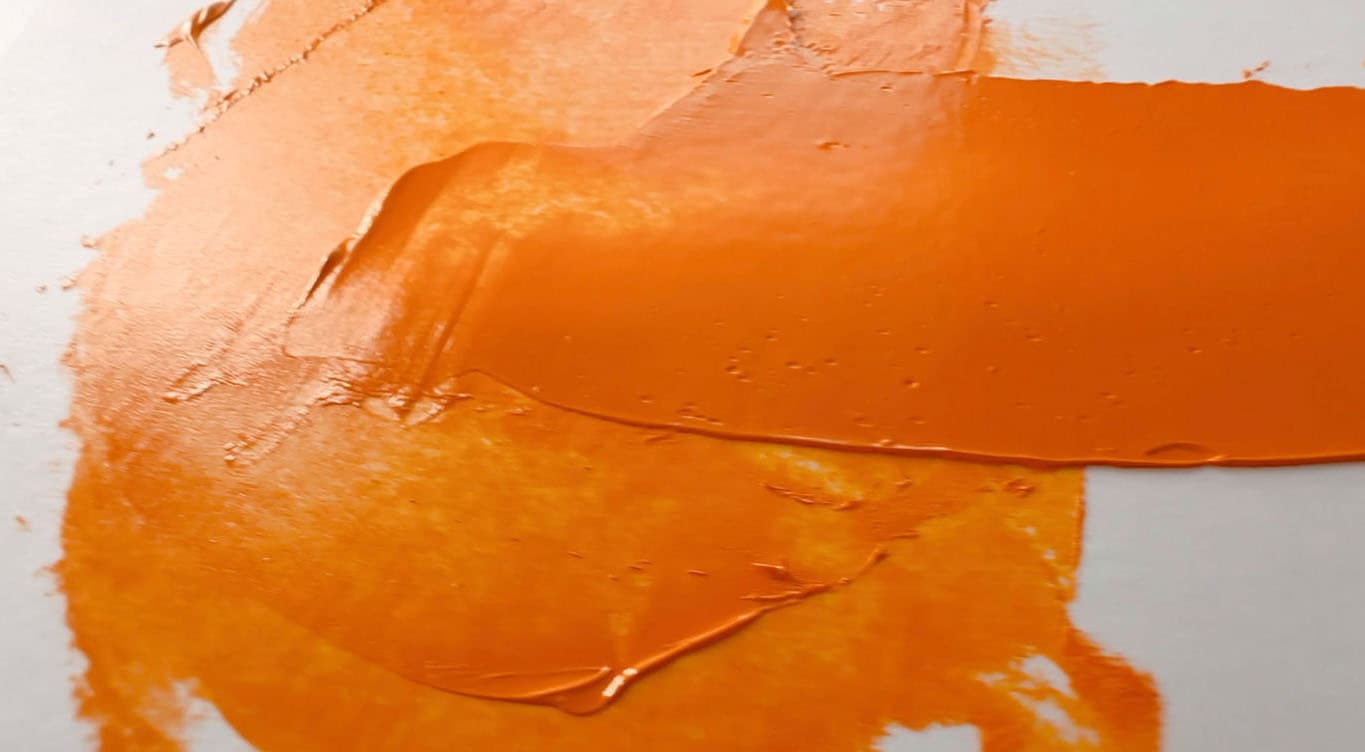
I soon began to quite enjoy this newcomer to the palette. While it would be nice to have even better lightfastness, for a synthetic organic orange, 7 out of 8 on the Blue Wool Scale is pretty good.

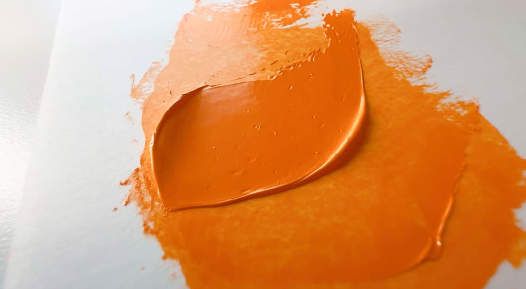
Perhaps the most common question about Benzimidazolone Orange is whether it can truly replace Cadmium Orange. We'll talk about it's features, its tints, and the million dollar question about cadmiums, and explore how it compares to the other oranges in the paintbox.

Article image

An Enterprising Orange

Benzimidazolone Orange is an interesting orange which is less opaque than Cadmium Orange. The word brash may be a bit strong, but may not fit as nicely into the lineup of cadmiums gracefully going from yellow to orange as some other colors- after all, the note it strikes could be called dissonant or from another view, lightly mellowed. On its own, the quality of comparative flatness disappears, and it becomes a bold orange in its own right.

In comparison with cadmiums, Benzimidazolone Orange is also slightly less lightfast, but could perhaps be more weatherfast, so we wouldn't consider it as a replacement. On its own terms Benzimidazolone Orange is an interesting color that leans toward yellow-orange, but we have also heard of redder shades. PO62 has a hint of desaturation which makes it throw an ever so slightly flat note in an arpeggio of cadmiums, but oddly when PO62 is viewed out of context it appears quite bright. Compared to other organic oranges it ranks quite high marks for lightfastness (though not perfect in tints). It also makes interesting grays with Ultramarine Blue. Among the non-cadmium oranges it seems like one of the better ones.

Lightfastness: Excellent.

Transparency: Semi-Transparent or Semi-Opaque (Not as opaque as Cadmium Orange).

Relative Dry Time: likely Slow.

Strength in Tints: Good.

Toxicity: May be more serious than was once thought, more details in the toxicity section. Mutagen.

General notes on categories: Transparency may vary due to paint formulation. Strength in tints will vary across brands due to varying amounts of pigment per brand and depends on how much filler a brand uses. Differences in dry time will also be noticed as some brands use driers which speed things up, or use different binding oils which may slow it down.

Compared with other oranges, Benzimidazolone Orange is -Slightly less chromatic than Cadmium Orange PO20 -A yellower orange than Pyrrole Orange PO73 -Less opaque than Cadmium Orange PO20

In oils, the drying time can vary, but it is usually listed as medium. PO62 tends to form good and somewhat flexible oil paint films.

Article image

Benzimidazolone Orange in Oils

Only a handful of companies offer PO62 as a single-pigment paint

A Yellowish Orange with a Touch of Transparency

Benzimidazolone Orange H5G, is labeled PO62 for short. An orange pigment, sometimes described as middle-value yellow to middle orange which is somewhere between semi-transparent and semi-opaque. It is often suggested as an alternative to cadmium orange, but PO62 does not have the same covering power, especially when used thinly. It is a lovely color on its own though, and so we'd suggest different uses for the two pigments.

Some sources, such as Mayer, describe it as transparent, which is interesting, as we have encountered it as semi-transparent. Whether this is due to paint formulation recipes or additives makes one wonder. At first we wondered if his notes may refer more to something like PO60 (a discontinued Benzimidazolone Orange) than PO62, but he has separate entries for both pigments.

The bit of radiance in thin applications can be detected in the picture here. Where a high quality cadmium orange has incredible opacity and coverage, the tendency to want to glaze can be found in PO62. If a person is looking for a single-pigment orange with touch more transparency, PO62 may be a good choice.

Article image

Tints

Sources differ on whether it's brighter or duller

Benzimidazolone Orange is a decently strong tinter, but not overwhelming. The tints retain the character of the masstone without spinning off too far in one direction or another.

Depending on the pigment load of a cadmium orange, some cadmiums may be stronger tinters, but Benzimidazolone Orange is no slouch. It has high but not quite perfect lightfastness in tints.

There is disagreement among sources as to the purity of the tints. One of the paint manufacturers who sells Benzimidazolone Orange states that it has the same color and masstone as a cadmium orange, but we haven't found that to be exactly true to our experience. The manufacturer goes on to say that its color can't be mixed as a secondary with a with the same purity, which seems to be true of both Benzimidazoloe and the Cadmium Oranges. What caught our eye was the comment that PO62 makes brighter tints.

Mayer's 1991 book (which was posthumous) mentions that PO62 is a bit dull in tints, so there may be some differences in the pigment sources or their behaviors, or perhaps Mayer may be referring to slight falloff in lightfastness.

The bit of semi-transparency this pigment has could be an advantage in some applications, and we enjoy its use in mixes.

Article image

PO62 in Tints

Benzimidazolone Orange retains its character in tints

PO62 in Tints 1
PO62 in Tints 2
PO62 in Tints 3

Does Benzimidazolone Orange replace Cadmium Orange?

Not really.

Compared with genuine Cadmium Orange, PO62 is less chromatic, less lightfast, and less opaque, but some versions may have good weatherfastness.

In terms of the highest chroma colors possible in oil paint, Benzimidazolone Orange falls slightly short of high quality cadmiums.

It turns out that Cadmium Orange, PO20, is actually a difficult pigment to replace. If a person is absolutely unable to use cadmiums, Benzimidazolone Orange could be a good option, however Benzimidazolone Orange PO62 is not as non-toxic as people think. (More on this in the section on toxicity).

In terms of painterly qualities, PO62 is slightly less opaque than Cadmium Orange, PO20, however, Benzimidazolone Orange is a little easier to coax into a glaze when used thinly.

Our main issue when it comes to replacement is the slight loss of chroma in PO62 as well as slightly less lightfastness.

Article image

PO62 compared with the range of Cadmium Oranges

Cadmium Orange covers a huge range. This Benzimidazolone is on the yellower-orange side of the spectrum

PO62 compared with the range of Cadmium Oranges 1

Benzimidazolone Orange Impasto

While this color makes glazes, it can be used full strength

In general in oil paints, the long-term fate of impasto work can be a bit iffy, but Benzimidazolone Orange seems as good as any color for this kind of work. The way the Gamblin version is formulated, the color has plenty of body and is fairly opaque, but shows a bit of glow in thin layers.

This particular rendition of PO62 happened to be an orange that leans yellow. Apparently it can also be found sometimes in a redder-orange edition, but the yellower-orange seems to be fairly common.

Just as a heads up, there is another Benzimidazolone Orange (PO60) which is different from PO62 and has different properties. Sometimes PO60 gets mentioned for its transparency, and given the similar names, the two can become conflated. Unfortunately PO60 has been discontinued, but we still have PO62.

Article image

Very Good Lightfastness

Slight falloff in tints

Benzimidazolone Orange, PO62, has very good lightfastness. Listed as ASTM I, but with BWS scales that show slight change (7 out of 8) in tints.

In watercolor, Bruce MacEvoy found it to be excellent.

One official source hints that the deeper shades may be more lightfast or weatherfast, saying, "Deep shades are very lightfast and weatherfast." Whether that means that lighter shades may be less so was not explained.

Historically, PO62 has received ASTM I - Excellent ratings in oil and acrylic with a slight falloff in Watercolor, ASTM II -Very Good. (For reference, the ASTM is a scale where I is good, and ASTM III is considered by many as the dividing line for being too poor for permanent works). The ASTM scores are in need of updating.

This color does not appear to have been evaluated in Golden's recent testing on the role of mixing whites in oils.

Article image

Toxicity

Possibly more toxic than was once thought

Previously thought to be in the category of Low Concern, new research suggests that there may be more concern warranted for Benzimidazolone Orange than was given to it in the past, as it is generally labeled as non-toxic.

We are grateful for Monona Rossol's work on pigments and hazards for artits, as there are currently gaps in the way that emerging research is disseminated to artists as well as areas where more research needs to be done. Specifically, Rossol highlights the lack of data surrounding PO62 and suggests that there may be concern from a chemical standpoint in regard to how it would metabolize. We are not toicologists, so please consult the relevant experts.

Rossol's work highlights that PO62 may be a mutagen and could also metabolize to cause a serious health condition called methemoglobinemia. Reference Monona Rossol's research available upon request here for more information.

As with all pigments, do not breathe the dust.

In regard to all art supplies, even ones labeled non-toxic, please treat all pigments and paints with proper studio safety protocols.

Article image

References

A Selected Bibliography

PO62 pigment data from David G. Myers, The Color of Art Pigment Database, Artiscreation.com

Information about PO62 from Bruce MacEvoy, Handprint Guide to Watercolors, General information about this class of pigments from Handprint

Hunger, Klaus, and Martin U. Schmidt.. Industrial Organic Pigments: Production, Crystal Structures, Properties, Applications, With contributions by Thomas Heber, Friedrich Reisinger, and Stefan Wannemacher, 4th ed. Wiley-VCH 2019. https://amzn.to/3ISJTE8 (also available through library apps like Hoopla)

Rossol, Monona. The Artist's Complete Health and Safety Guide. New York, NY : Allworth Press, 2001. The book is rather dated, updated information is available from her website

Mayer, Ralph. The Artist's Handbook of Materials and Techniques, 5th ed. New York, NY, Penguin Group, 1991. https://amzn.to/44OzBN9

__

Article written by Melissa Carmon

About the author: When a sudden urban firestorm threatened their studio, Melissa and her husband Jonathan rescued The Great Book of Color, about 800 pages of her handwritten notes gleaned from her years of painting. They co-founded the Paint List to empower fellow painters around the world. More can be found here.

Article image

Subscribe for More Articles From the Great Book of Color

If you'd like to receive the latest illuminations from the Great Book of Color and Paint List news in your inbox, subscribe to the newsletter here.

Thanks for reading and Happy Painting!

Cadmium Red Deep and Cadmium Red Medium Color Comparison and Review
Deep and Brimming with High Chroma, Let's Compare Best-in-Class Cadmium Reds
Cadmium Red Mediums vs. Cadmium Red Lights- Premium Oil Paints
World-Rocking Reds Worthy of a Matisse or Kandinsky
Warmest Cadmium Red Lights vs Cadmium Red Oranges Oil Paint
Where Cadmium Red Light Begins and Ends: a Spotlight on Some of the Warmest Cadmium Reds and the Reddest Cadmium Oranges
Cadmium Oranges Oil Paint Color Comparison and Reviews
The Must-Have Color on Your Palette You Never Knew You Were Missing
Cadmium Yellow Deep Oil Paint Color Comparisons
Somewhere Between Tangerine and Sunshine, These Cadmium Yellow Deeps Light Up Any Palette
Cadmium Yellow Lights Artist Oil Color Comparison
These Collectible Cadmium Yellow Lights Make Unique Contributions to the Color Spectrum
Cadmium Greens, a Comparison
Cadmium Greens span several hues- which one is best for your next painting?
Phthalo Green: Beryl and Aquamarine Oil Paint Color Comparisons
Rich with Mystery and Mystique, The Best Phthalo Blue Greens Do Yield Some Surprises
Phthalo Blue (Green Shade) Oil Paint Reviews
High Chroma Turquoise Here We Come! These Blazing Blues are Some of the World's Most Powerful Paints
Ultramarine Blue Oil Paint Comparison
From A Word Meaning Over the Sea, these Deep Blue Beauties are an Old-World Painter's Dream Come True
Phthalo Green Blue Shade PG7
The essence of green, this is an elemental gem of the palette
Williamsburg Oil Paint Review
With a Stunning Rainbow of Single-Pigment Paints, this Paintmaker Has Led the Way in Oil Paint Testing
Gamblin Artist Oils Review
Thick Impasto Paint and a White Paint for Every Occasion. Is Gamblin the Right Paint for You?
Limited Availability Pigments
Discontinued Pigments Can Lead to Discontinued Paints: The Recently Lost Pigments and How the Paintlist Can Help
Mix Your Own YInMn Blue Hue, Part 1
Mix an approximation of this elusive paint with our three simple recipes. These mixes will get you close with paints you may already have in your paintbox
Paint List Holiday Guide - 2023 - Oil Paints
It's the Holiday Season so we're taking a break from the studio to look at the best of what we see out there this year.
Unlocking the Palette with the Pigment List
A painter's secret superpower
How to Use Paint List
Find and Save Paints- Elevate Your Art
PW6 - Titanium White
This Ubiquitous Pigment is Cool, Inert, and Unruffled
PB15 Phthalo Blue
PB15 Phthalo Blue
Meet This Excelsior Cyan In A New Way
PBr7 Natural Brown Oxide, And a Lost History
From Scarce Raw Siennas to Beautiful Burnt Umbers, Tales of Old Pigments Still Inspire
The Great Book of Color
Saving the Lost Wisdom of the Painters
PB29 Ultramarine Blue
A Blue Forged in the Furnace, an Enchanting Blue Beyond Compare
The Tetra, an Ancient Limited Palette
A super-limited palette with endless possibilities
PO62 - Benzimidazolone Orange
With High Lightfastness and Semi-Opacity, this is a Yellow-Orange Worth Meeting
Pigment Spotlight: Pyrrole Red PR254
From Pastel Pinks to Fast Cars: A High-Performing Lightfast Red
PR255 - Pyrrole Scarlet
Vivid and Versatile, this Feisty Red is Unparalleled in Tints
Fire Recovery Resources for Artists
When an unexpected urban firestorm hits your studio, here are resources
PO48 Quinacridone Burnt Orange - Extinct
Key to the Lost World of Botanic Browns
2025 Paint List Holiday Gift Guide - Oils
Dreamy Paint Sets, Enchanting Minis, and a perfect studio stocking stuffer
PB35 Cerulean Blue Genuine
Stable, Reliable, and Expensive, This Sociable Sky Blue is a Stellar Mixer

Sign up for our newsletter

We value your privacy and won't share your email address.
Paint List Logo
This is an independent paint review site for artists that is powered by affiliate links. That means that we may make commissions on purchases that you make at no extra cost to you.
Disclaimer: This website does not make any warranties or guarantees about the completeness, reliability, and accuracy of this information. Any action you take upon the information you find on this website is strictly at your own risk. We will not be liable for any losses and/or damages in connection with the use of our website.