Journey to the Botanic Gardens
This site is community-supported. We may earn a commission (at no extra cost) when you buy through our links.
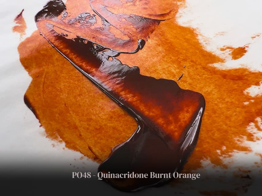
PO48 Quinacridone Burnt Orange - Extinct
Key to the Lost World of Botanic Browns
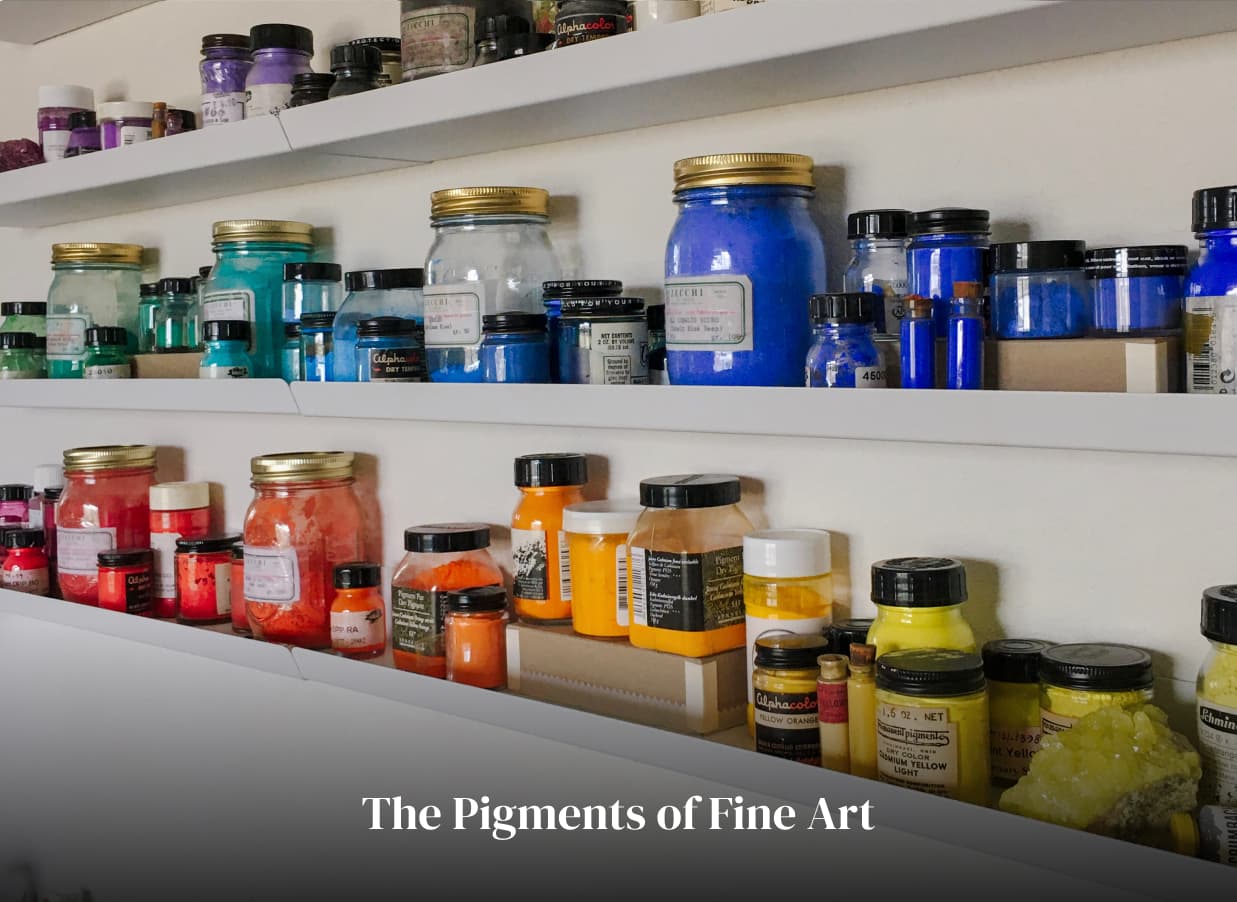
Featured Paints
An Excellent Botanic Brown
The soaring atrium made of vaulted stone caught the dull murmur of a hundred conversations in a wash of dull grey noise-- it reminded me of what happens with paintwater, where bits of each color blur together into one pale mid-grey hum. At the botanic garden, the hushed museum-like white noise of a hundred distant conversations melted behind me as I stepped through the heavy oak doors to the specialty library. Here the shelves of the books absorbed every sound, so that even my footsteps went silent.
As a student I had worked in university libraries and public libraries for many years, but this library was different. Here was the designated realm of the botanic artists-- a courtly society which praises precise pencil drawings, thin and controlled watercolor washes, and the textural nuances of leaf veins. Here you will find the experts the 101 sap greens recipes in the world, and there is no better place in which to learn about the subject of botanic browns.
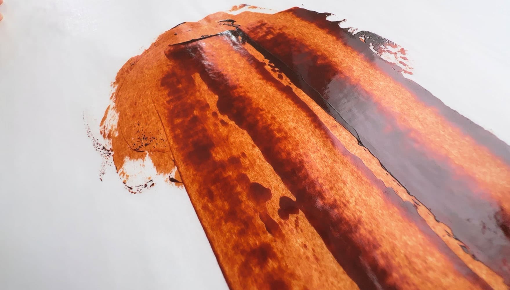
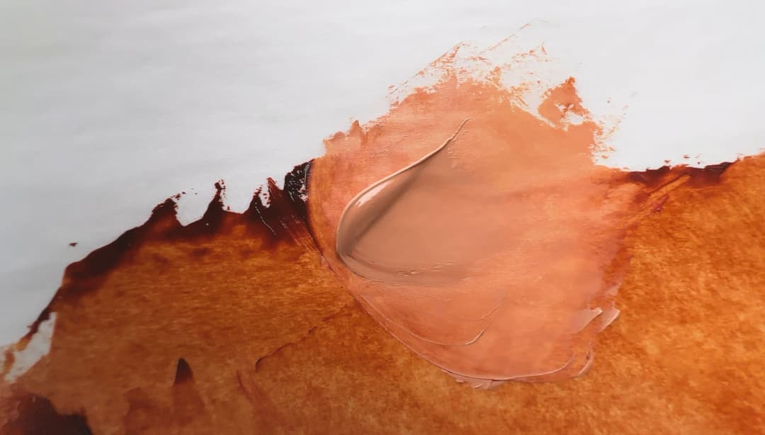
It was here, among the watercolorists, that I was first introduced to Quinacridone Burnt Orange. In some ways, PO48 has the fire of an orange and the gravitas of dark brown. The only bittersweet element to this discovery was that the pigment had already technically gone extinct, so all the mentions of this color were tinged with both praise and regret.
A fresh appreciation for the power of a transparent orange-brown for all things botanic became impressed upon me. Those slender wilting stems, as thin and grateful as a cilantro stalk, transformed from garish greens to educated foliage tones with just a touch of this marvelous quinacridone.
There is no pigment quite like Quinacridone Burnt Orange
Overview of PO48
The Color of Radiant Rust, This is an Orange-Brown Gem
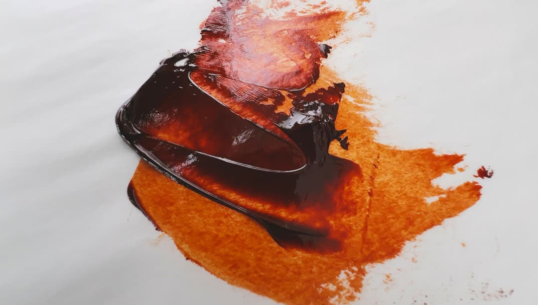
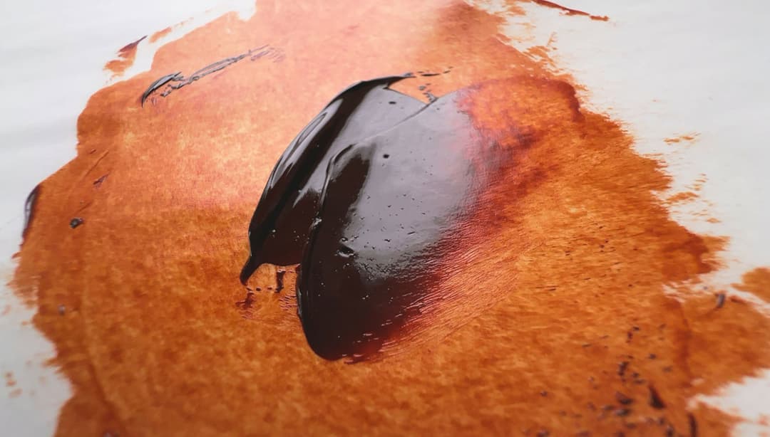
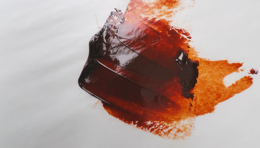
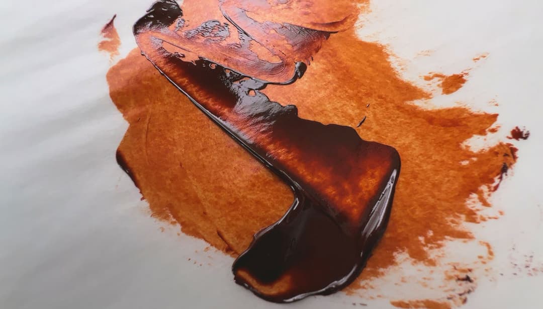
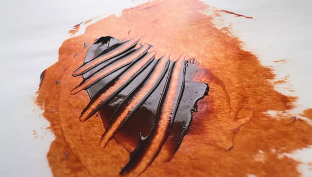
Quinacridone Burnt Orange is a gemtone-deep orange-brown with high transparency. If an earth tone could become a powerful synthetic organic pigment, this would be how we'd imagine it. It's exceedingly useful for the highest saturation darks in the orange area of the gamut. Unfortunately, this lovely pigment is extinct. We've heard that its main use was in the automotive industry where it was particularly beloved for its use in metal coatings.
Lightfastness: Excellent Transparency: Transparent Relative Dry Time: Medium to Slow Strength in Tints: Good Toxicity: Low
General notes on categories: In general, strength in tints will vary across brands due to varying amounts of pigment per brand and depends on how much filler a brand uses. Differences in dry time may also be noticed as some brands use driers which speed things up, or use different binding oils which may slow it down, but as Quinacridone Orange is very hard to find, it may be a case for rejoicing if you can find it at all.
Compared with other oranges, Quinacridone Burnt Orange is,
-More chromatic than the Natural Iron Oxides, PBr7,
-More gem-like and more orange than most Burnt Siennas,
-Capable of highly saturated low lightness colors.
PO48, commonly called Quinacridone Burnt Orange, has a range of names including Cinquasia Red Gold, Quinacridone Rust, Quinacridone Orange, and even (confusingly) Quinacridone Gold, which is a name that is also, oddly enough, used for another pigment, PO49. Quinacridone Burnt Orange PO48 is a deep orange pigment, it is has an extra orangey-red warm note, especially in glazes.
Quinacridone Burnt Orange is transparent. In oils, the drying time can vary, but it is usually listed as Medium to Slow. PO48 forms good and somewhat flexible oil paint films.
Quinacridone Burnt Orange in Oil Paints
Some manufacturers still have reserves of this extinct color
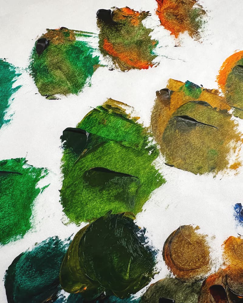
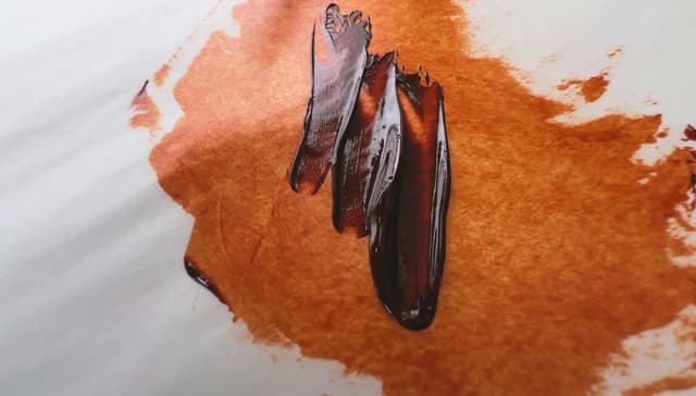
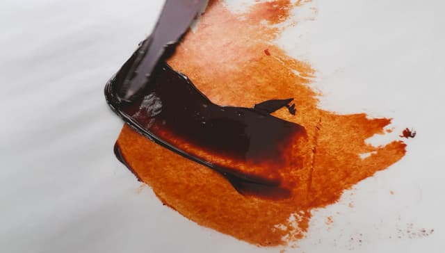
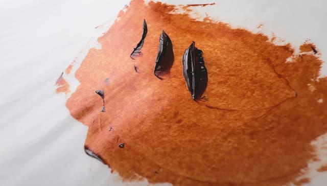
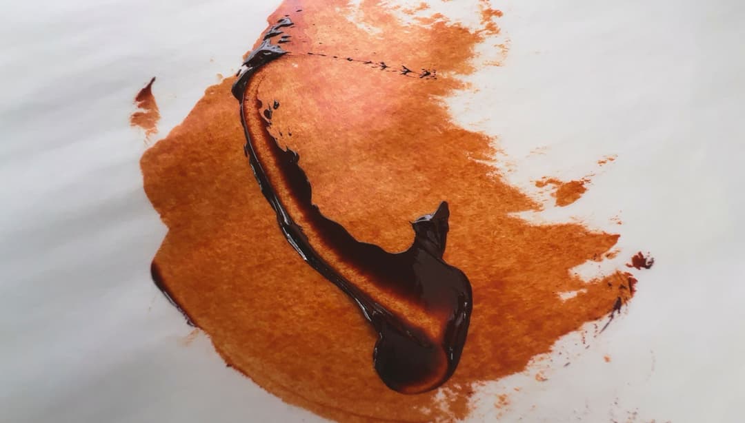
Landscape Greens and Botanic Browns
Gorgeous Greens made out of Burnt Orange?
Yes, quite so.
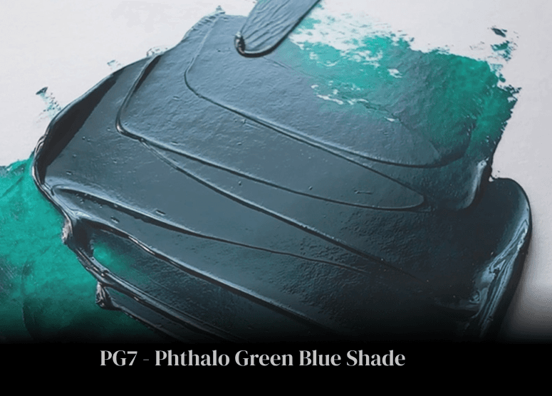
The top row here illustrates some of the gorgeous greens that emerge with Phthalo Green PG7 and just a bit of Quinacridone Burnt Orange PO48.
In some places in row 2, another yellow orange which is popular in Sap Green blends, PY110 is added to draw out the leaf-greens a bit more.
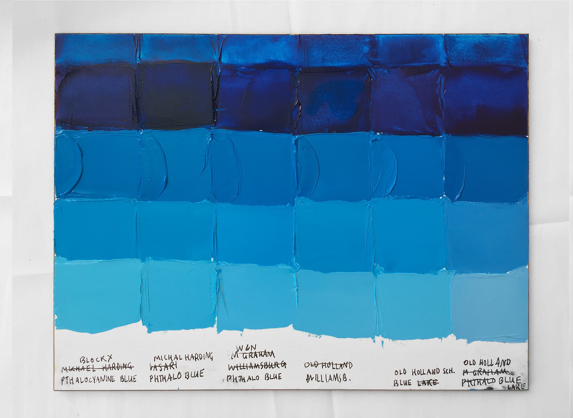
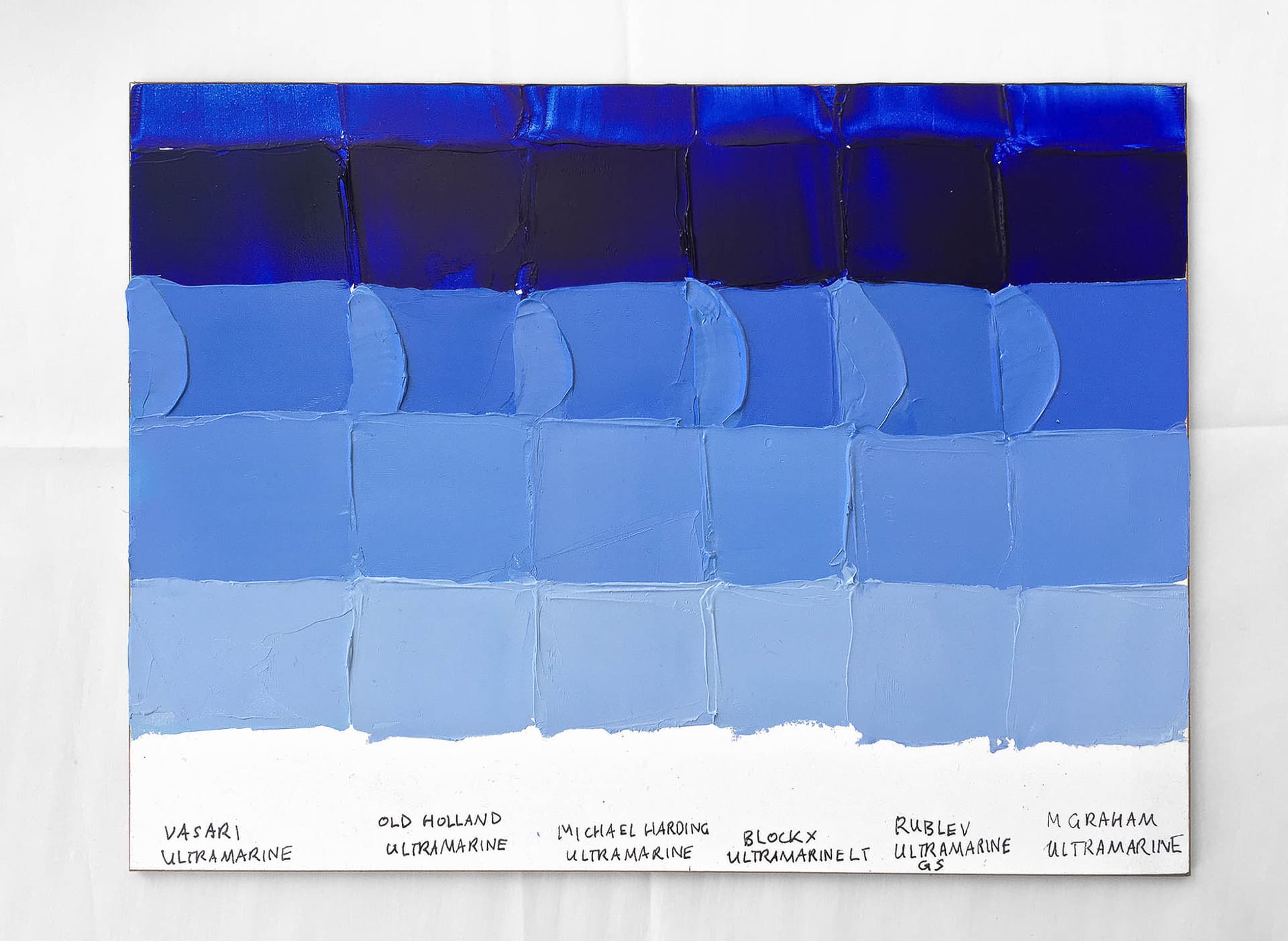
When mixed with blues, Quinacridone Burnt Orange yields some stunning transparent botanic browns.
Tints
Quinacridone Orange and its Apricot Tints
Quinacridone Gold probably shines best in transparent applications, and given how precious it has become, we'd tend to reserve it for glazes or super-saturated low notes.
However, as part of its surprising and multi-dimensional personality, despite being dark red-brown in masstone, a bit of white sends it into lovely peachy tints.
Tints of Quinacridone Burnt Orange with Titanium White
Excellent Lightfastness
An asset to the palette that was hard to match
Quinacridone Burnt Orange, PO48 has excellent lightfastness.
It consistently receives highest marks in most media, but may be less lightfast in watercolor, where it is still rated as Very Good by the ASTM. For context, historically, it has received an ASTM I- Excellent rating in oil and acrylic, with an ASTM II- Very Good in Watercolor. For reference, the ASTM has a scale where 1 is good, 3 is the dividing line for too poor for permanent works, and 5 fades badly. The ASTM scores are in need of updating, so we do not have any data on its lightfastness in various mixing whites. However, since Quinacridone Burnt Orange is extinct, it is unlikely to be reevaluated for lightfastness.
In watercolor, Bruce MacEvoy’s tests found it to be excellent as well.
Low Toxicity
Thought to be Lower Concern
PO48 is thought to be in the category of lower concern, but take care to avoid it in dust form. Several sources have mentioned that it is important to avoid breathing the dust. As always, consult proper health and safety experts for handling and toxicity information, and treat all pigments and paints with studio safety protocols.
Quinacridone Burnt Orange, PO48
Quinacridone Burnt Orange in Oil Paints
An orange-brown gemtone. We'll Miss This Transparent, High-Chroma Orange Brown
Resources
A short bibliography
PO48 pigment data from David G. Myers, The Color of Art Pigment Database, Artiscreation.com
Information about PO48 from Bruce MacEvoy, Handprint Guide to Watercolors, General information about this class of pigments from Handprint,
Mayer, Ralph. The Artist's Handbook of Materials and Techniques, 5th ed. New York, NY, Penguin Group, 1991. https://amzn.to/44OzBN9
Hunger, Klaus, and Martin U. Schmidt.. Industrial Organic Pigments: Production, Crystal Structures, Properties, Applications, With contributions by Thomas Heber, Friedrich Reisinger, and Stefan Wannemacher, 4th ed. Wiley-VCH 2019. https://amzn.to/3ISJTE8.
__
Article written by Melissa Carmon About the author: When a sudden urban firestorm threatened their studio, Melissa and her husband Jonathan rescued The Great Book of Color, about 800 pages of her handwritten notes gleaned from her years of painting. They co-founded the Paint List to empower fellow painters around the world. Read More.
Quinacridone Orange, a unique pigment on the palette
Subscribe for More Articles From the Great Book of Color
If you'd like to receive the latest illuminations from the Great Book of Color, as well as recent Paint List news in your inbox, subscribe to our newsletter here.
Thanks for reading and Happy Painting!
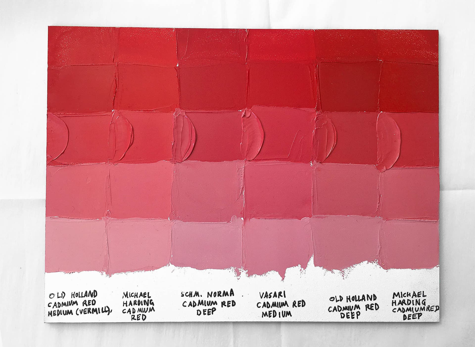
Cadmium Red Deep and Cadmium Red Medium Color Comparison and Review
Deep and Brimming with High Chroma, Let's Compare Best-in-Class Cadmium Reds
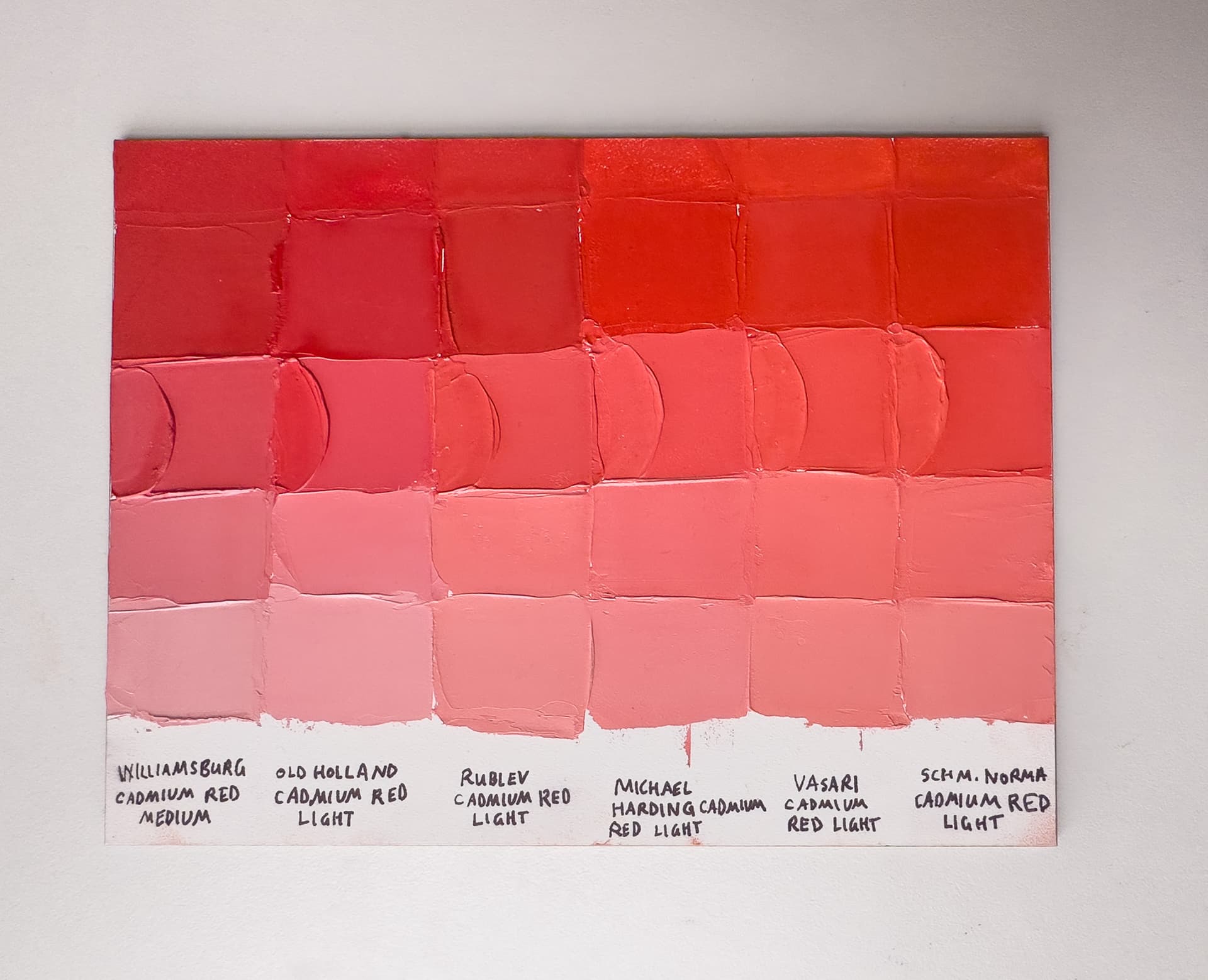
Cadmium Red Mediums vs. Cadmium Red Lights- Premium Oil Paints
World-Rocking Reds Worthy of a Matisse or Kandinsky
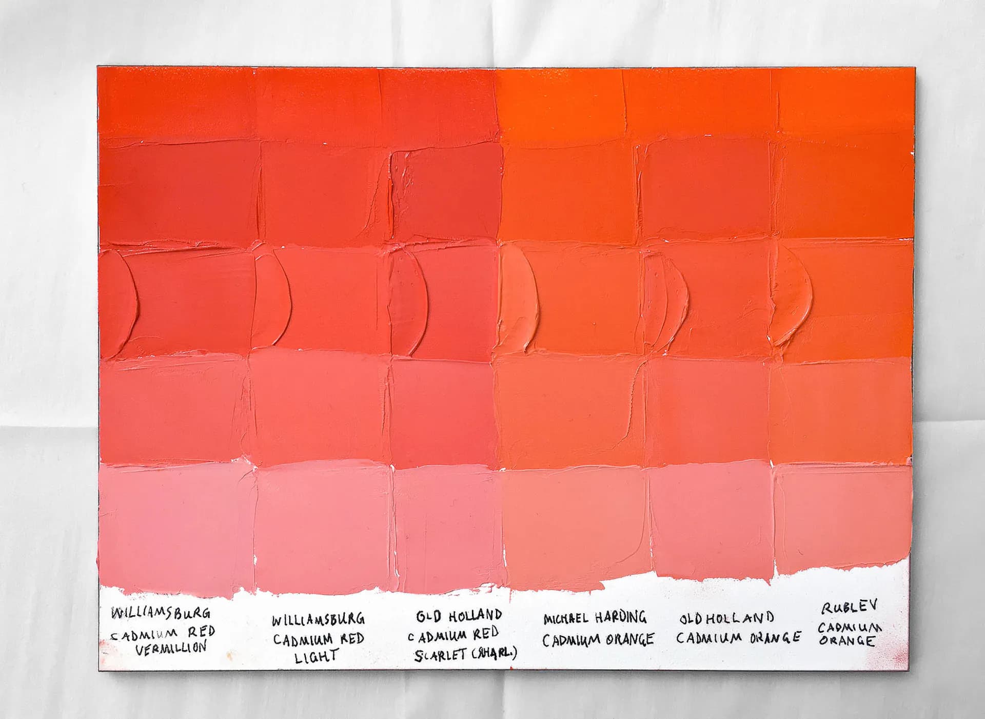
Warmest Cadmium Red Lights vs Cadmium Red Oranges Oil Paint
Where Cadmium Red Light Begins and Ends: a Spotlight on Some of the Warmest Cadmium Reds and the Reddest Cadmium Oranges
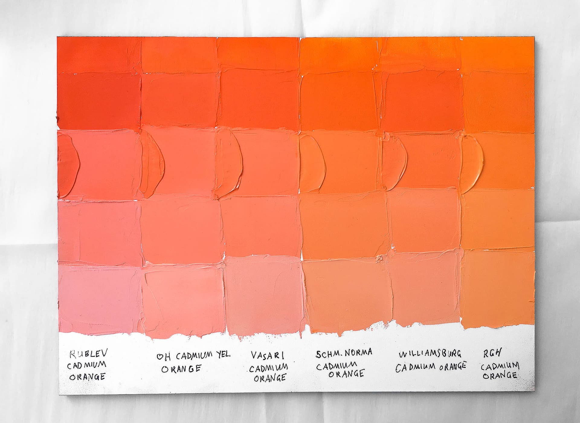
Cadmium Oranges Oil Paint Color Comparison and Reviews
The Must-Have Color on Your Palette You Never Knew You Were Missing
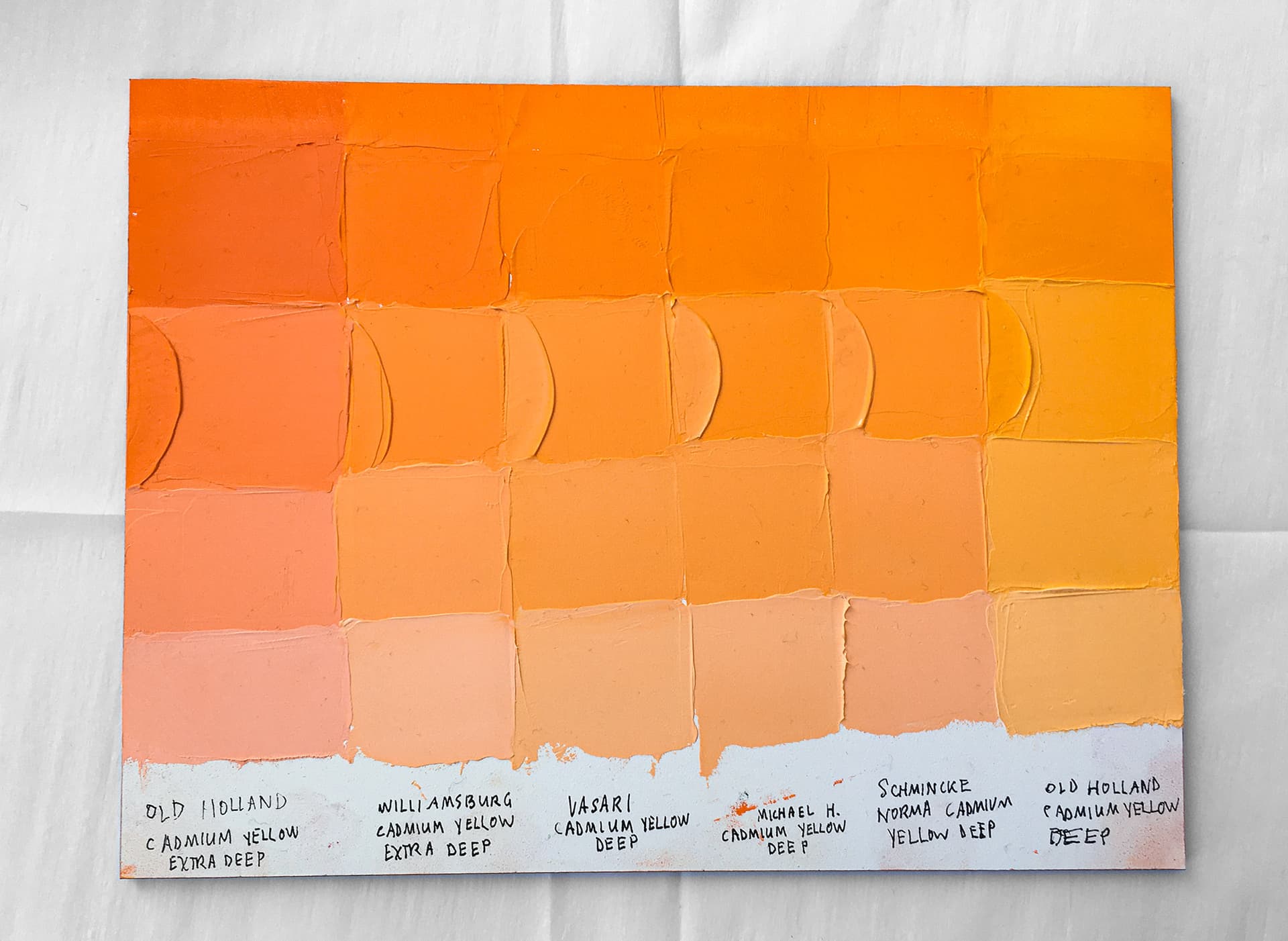
Cadmium Yellow Deep Oil Paint Color Comparisons
Somewhere Between Tangerine and Sunshine, These Cadmium Yellow Deeps Light Up Any Palette
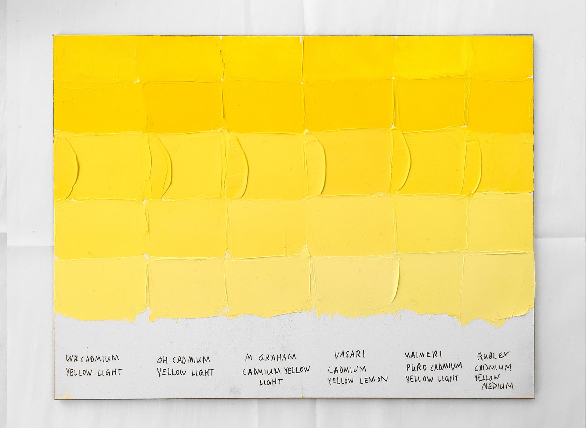
Cadmium Yellow Lights Artist Oil Color Comparison
These Collectible Cadmium Yellow Lights Make Unique Contributions to the Color Spectrum
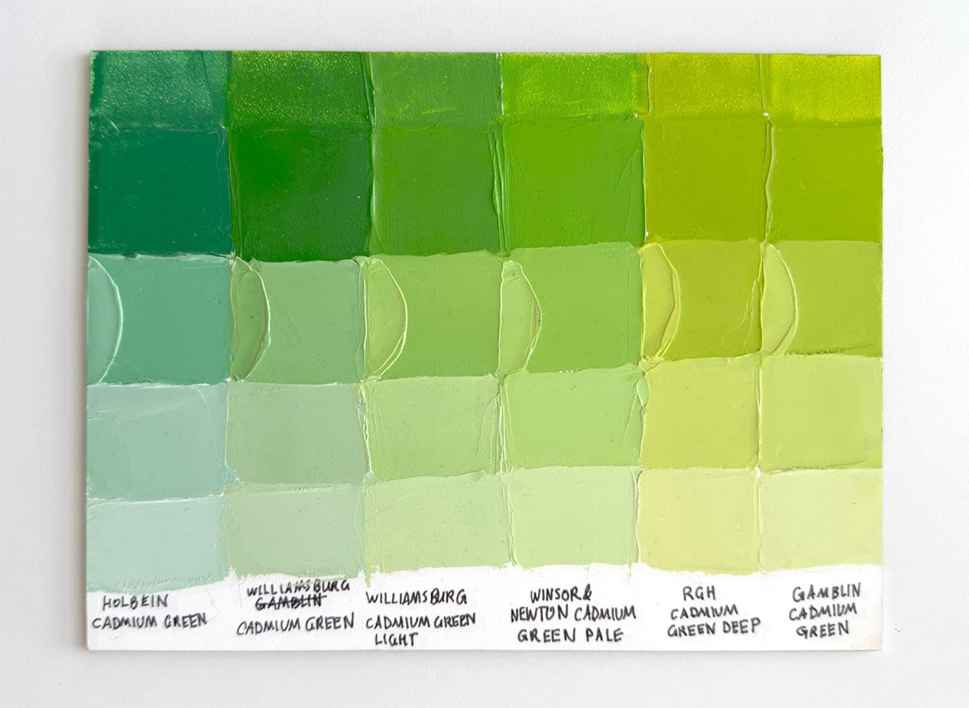
Cadmium Greens, a Comparison
Cadmium Greens span several hues- which one is best for your next painting?
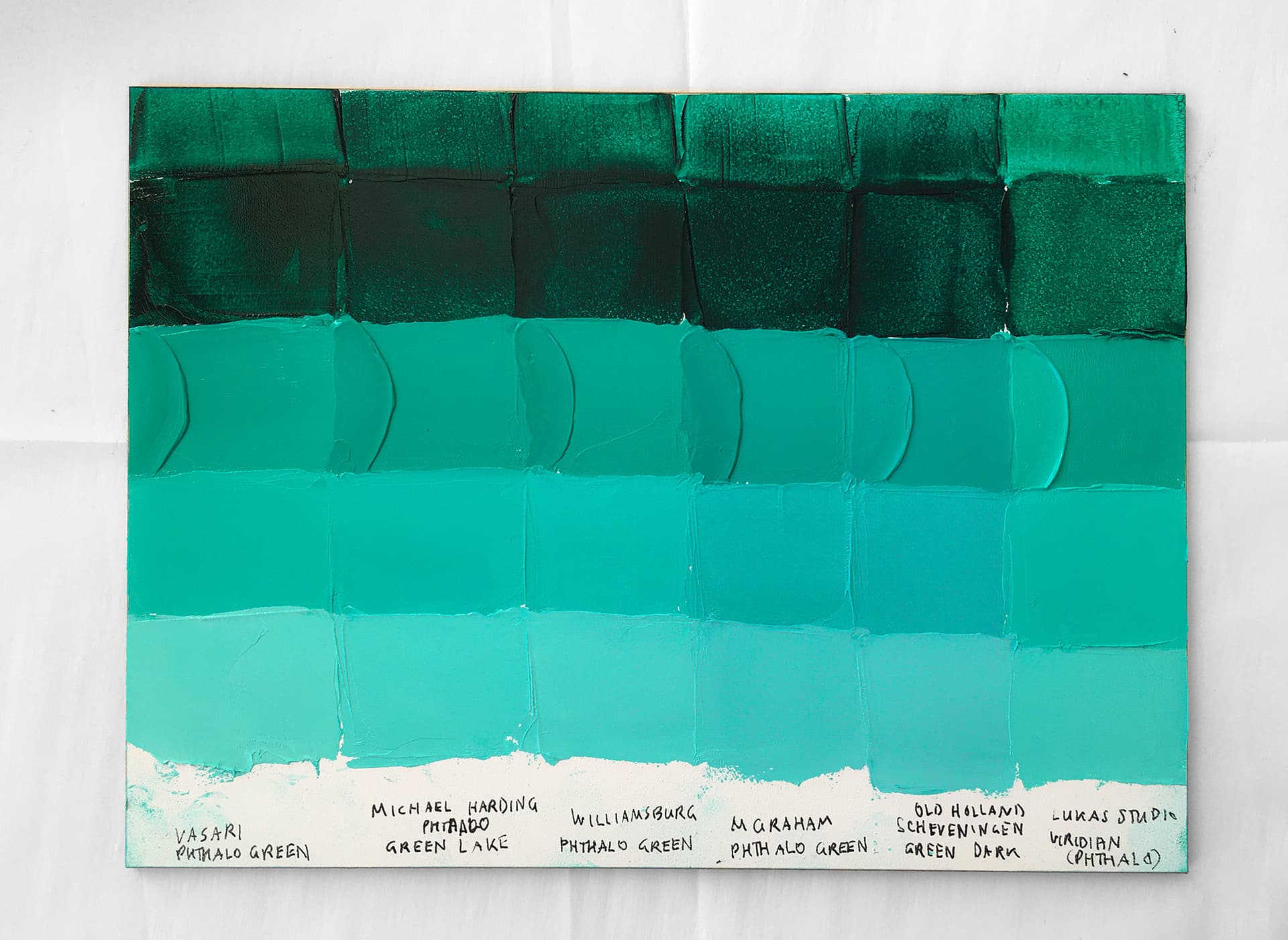
Phthalo Green: Beryl and Aquamarine Oil Paint Color Comparisons
Rich with Mystery and Mystique, The Best Phthalo Blue Greens Do Yield Some Surprises
Phthalo Blue (Green Shade) Oil Paint Reviews
High Chroma Turquoise Here We Come! These Blazing Blues are Some of the World's Most Powerful Paints
Ultramarine Blue Oil Paint Comparison
From A Word Meaning Over the Sea, these Deep Blue Beauties are an Old-World Painter's Dream Come True
Phthalo Green Blue Shade PG7
The essence of green, this is an elemental gem of the palette
Williamsburg Oil Paint Review
With a Stunning Rainbow of Single-Pigment Paints, this Paintmaker Has Led the Way in Oil Paint Testing
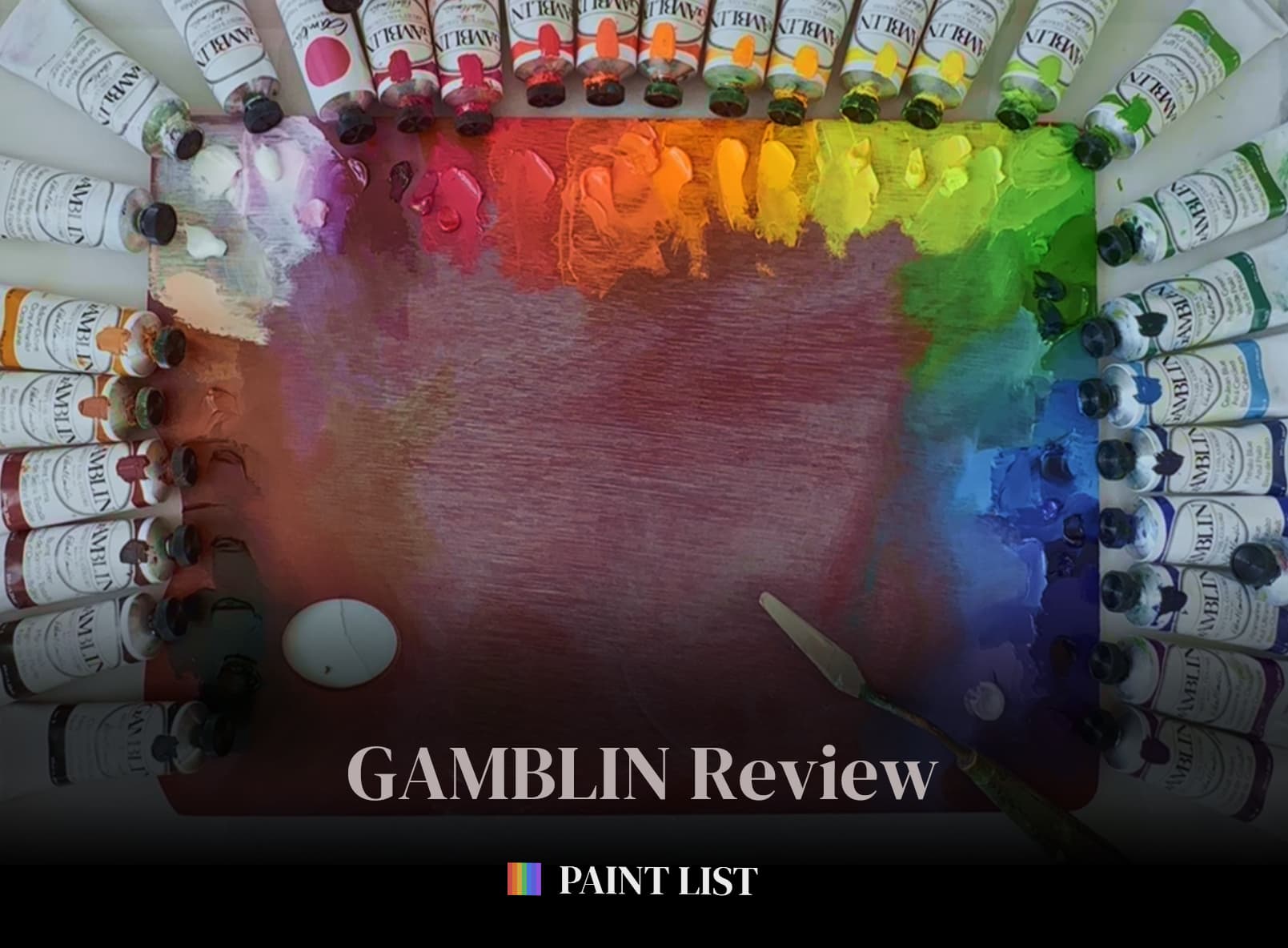
Gamblin Artist Oils Review
Thick Impasto Paint and a White Paint for Every Occasion. Is Gamblin the Right Paint for You?
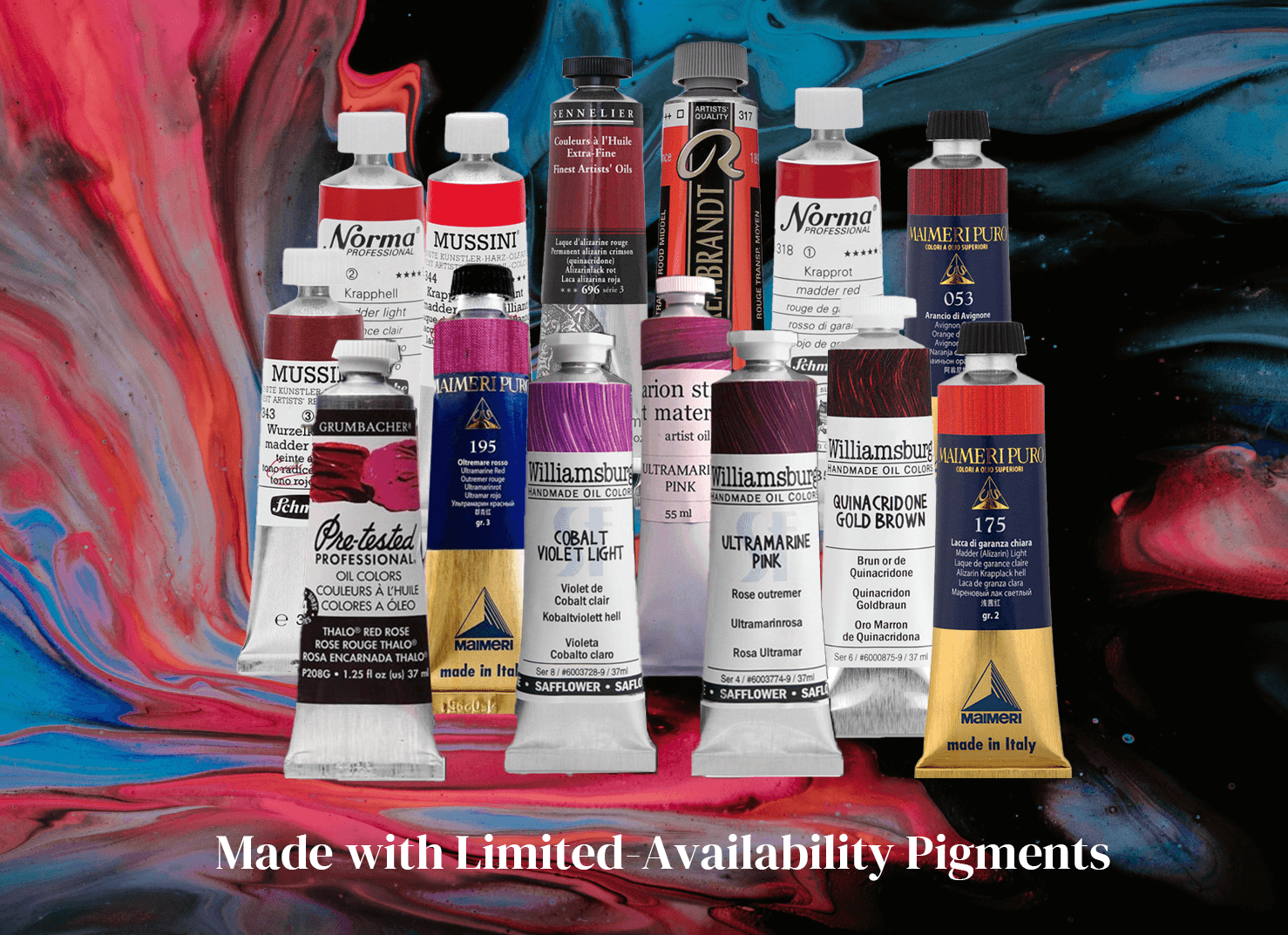
Limited Availability Pigments
Discontinued Pigments Can Lead to Discontinued Paints: The Recently Lost Pigments and How the Paintlist Can Help
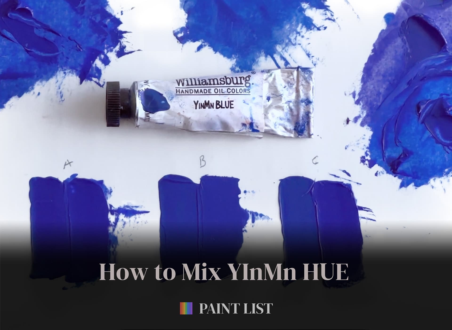
Mix Your Own YInMn Blue Hue, Part 1
Mix an approximation of this elusive paint with our three simple recipes. These mixes will get you close with paints you may already have in your paintbox
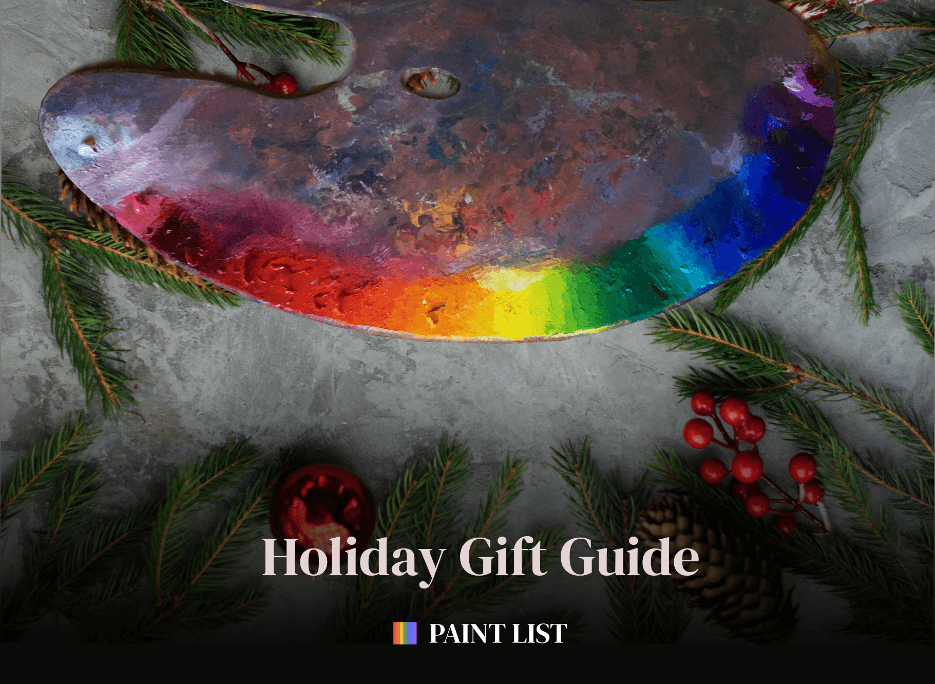
Paint List Holiday Guide - 2023 - Oil Paints
It's the Holiday Season so we're taking a break from the studio to look at the best of what we see out there this year.
Unlocking the Palette with the Pigment List
A painter's secret superpower
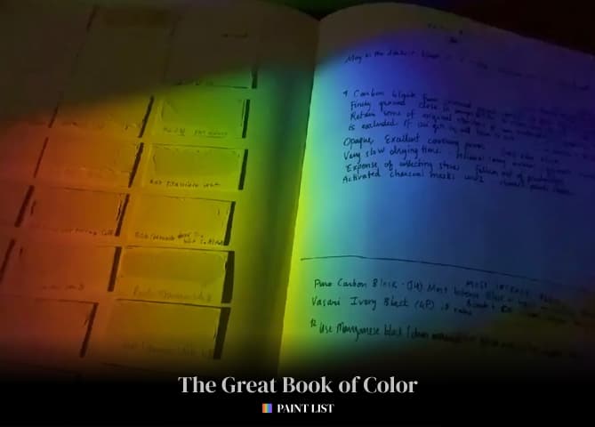
The Great Book of Color
Saving the Lost Wisdom of the Painters
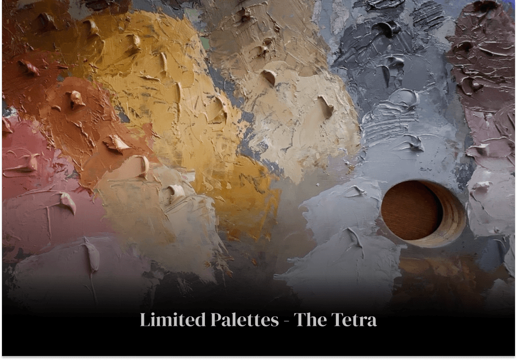
The Tetra, an Ancient Limited Palette
A super-limited palette with endless possibilities
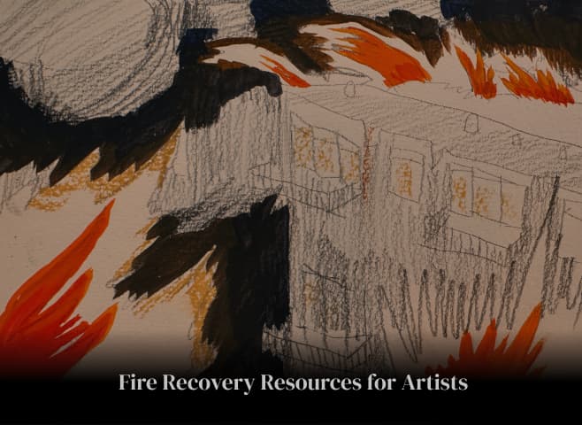
Fire Recovery Resources for Artists
When an unexpected urban firestorm hits your studio, here are resources
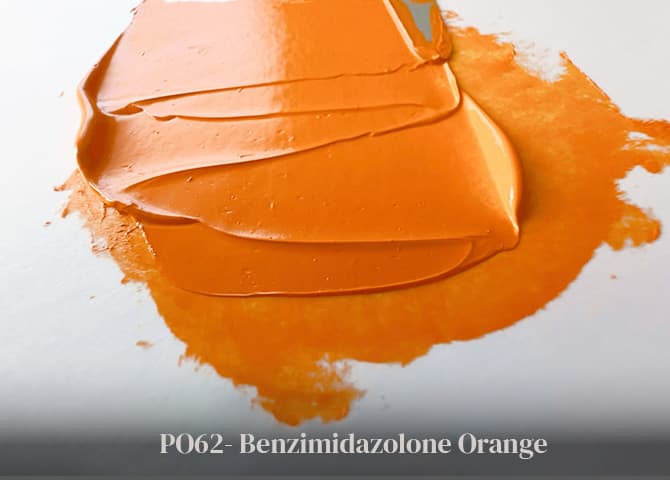
PO62 - Benzimidazolone Orange
With High Lightfastness and Semi-Opacity, this is a Yellow-Orange Worth Meeting
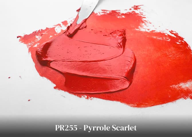
PR255 - Pyrrole Scarlet
Vivid and Versatile, this Feisty Red is Unparalleled in Tints
.png&w=1920&q=75)
Pigment Spotlight: Pyrrole Red PR254
From Pastel Pinks to Fast Cars: A High-Performing Lightfast Red
PO48 Quinacridone Burnt Orange - Extinct
Key to the Lost World of Botanic Browns
2025 Paint List Holiday Gift Guide - Oils
Dreamy Paint Sets, Enchanting Minis, and a perfect studio stocking stuffer
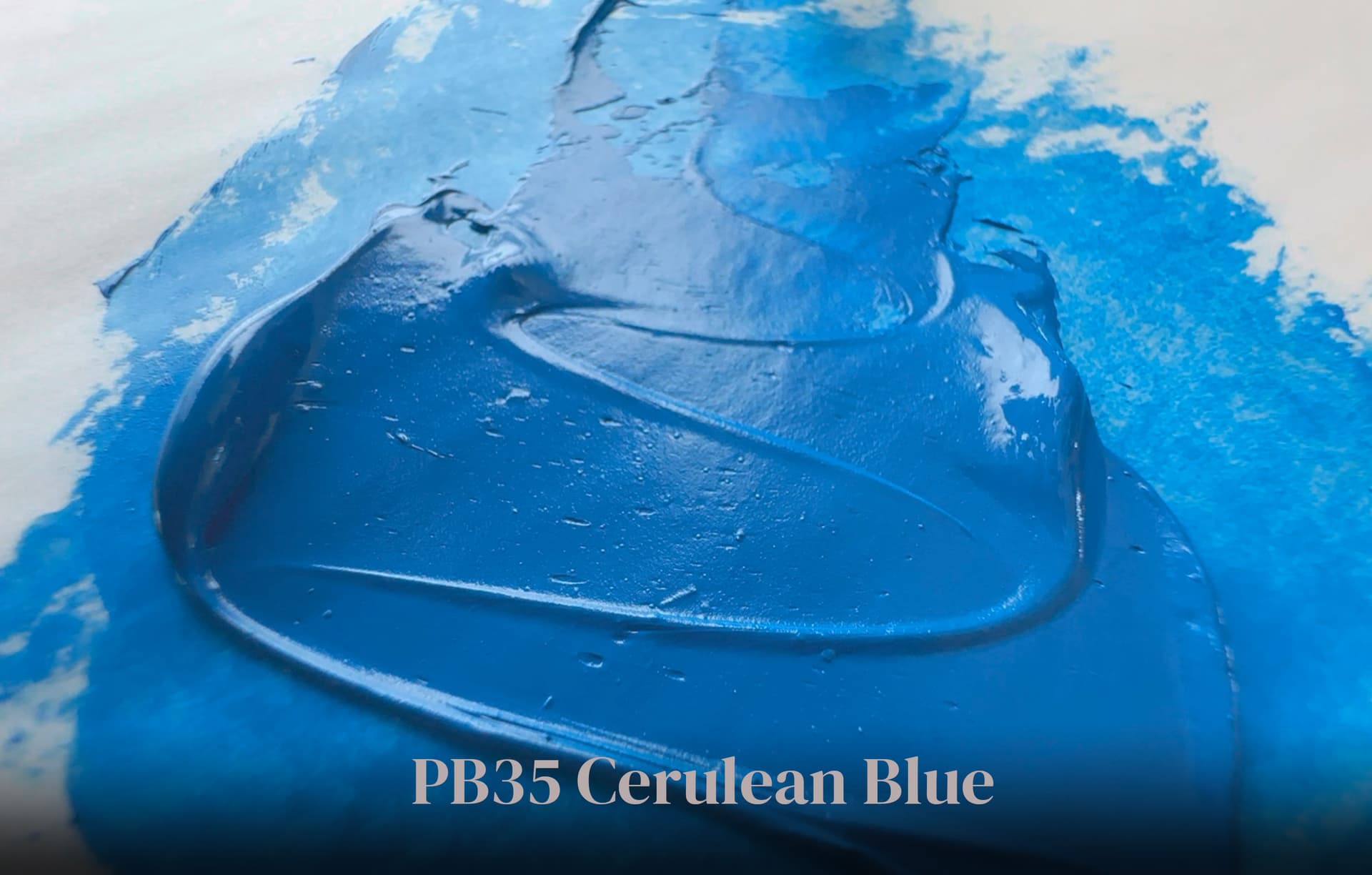
PB35 Cerulean Blue Genuine
Stable, Reliable, and Expensive, This Sociable Sky Blue is a Stellar Mixer
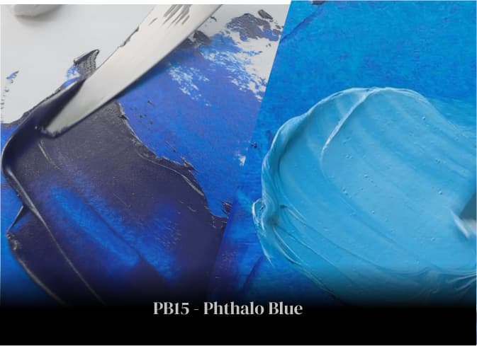
PB15 Phthalo Blue
Meet This Excelsior Cyan In A New Way
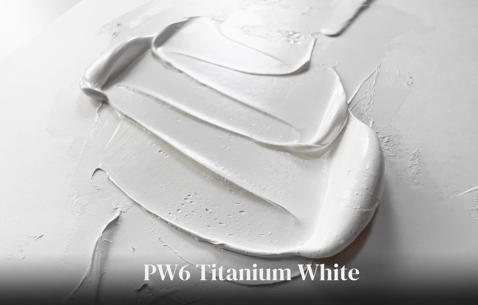
PW6 - Titanium White
This Ubiquitous Pigment is Cool, Inert, and Unruffled
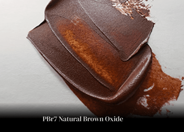
PBr7 Natural Brown Oxide, And a Lost History
From Scarce Raw Siennas to Beautiful Burnt Umbers, Tales of Old Pigments Still Inspire
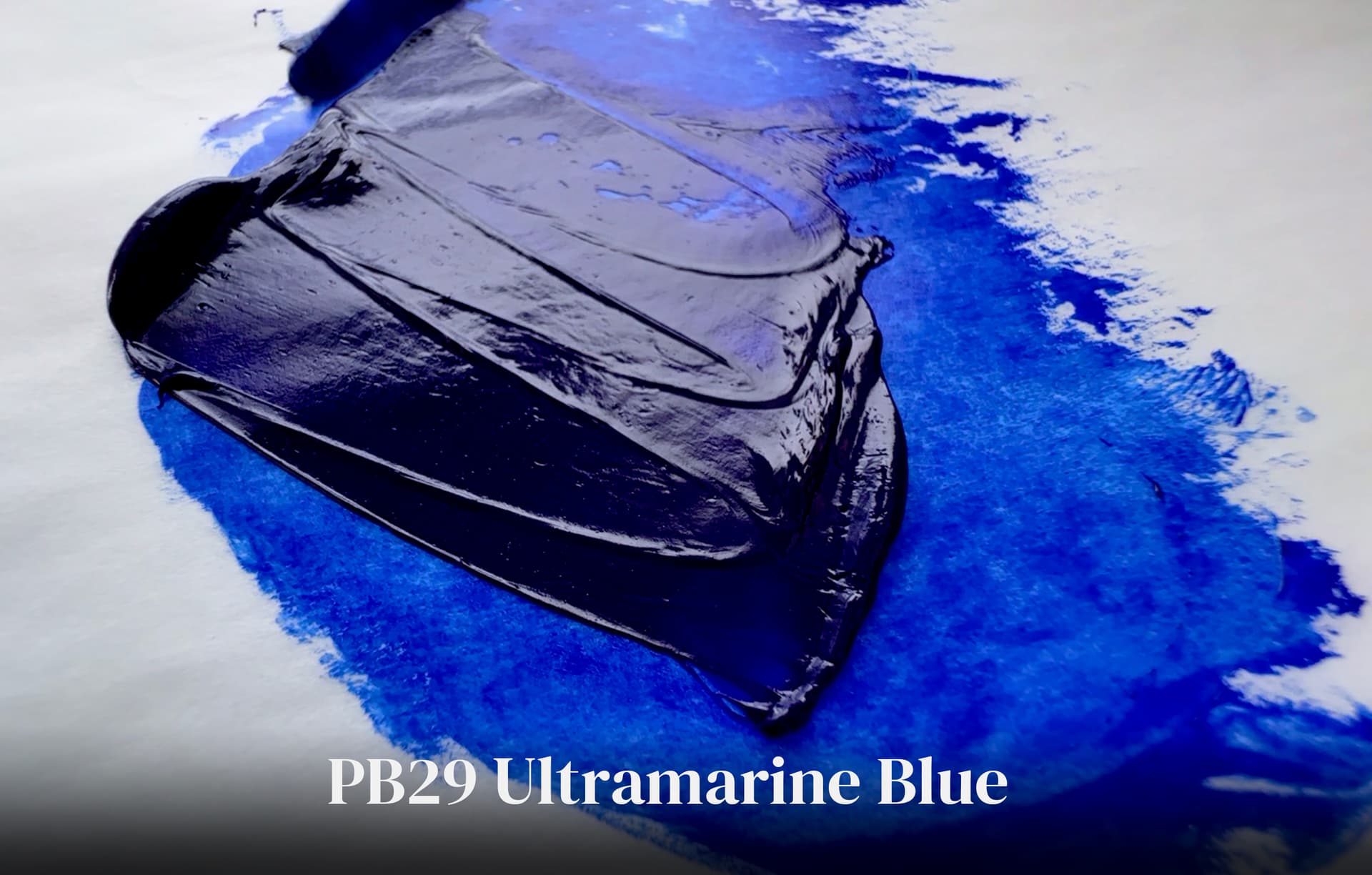
PB29 Ultramarine Blue
A Blue Forged in the Furnace, an Enchanting Blue Beyond Compare